This tutorial shows how to use the Topographica software package to explore an orientation map simulation using test patterns and weight plots.
The simulations explored in this notebook use the GCAL model (Stevens et al., J. Neuroscience 2013) , a relatively simple and easy-to-understand cortical model. As described in Bednar (J. Physiology-Paris, 106:194-211 2013) , much more complex and realistic simulations can be built using the same underlying components in Topographica, e.g. by including multiple cell classes and laminae in each simulated region, or simulating finer time steps, but this model is already capable of surprisingly complex behavior.
This tutorial is also compatible with the earlier LISSOM model, which has been used extensively in publications (e.g. Miikkulainen et al., 2005). We have made it easy to select the LISSOM model at the start of the notebook and it should be possible to follow the rest of the tutorial without any additional changes, though of course any mention of GCAL explicitly should be updated to say LISSOM instead.
An advanced tutorial is also available, demonstrating a more sophisticated analysis of the GCAL model as used in the published paper. This second GCAL tutorial is more suited to users already familiar with Topographica.
If you can double-click on this text and edit it, you are in a live IPython Notebook environment where you can run the code and explore the model. Otherwise, you are viewing a static (e.g. HTML) copy of the notebook, which allows you to see the precomputed results only. To switch to the live notebook, see the notebook installation instructions.
We will start the notebook by importing the various components we will
be using. You can run the following code cell by pressing
Shift+Enter or clicking the 'play' button from the menu above:
In [ ]:


%reload_ext topo.misc.ipython
In [ ]:


import os, math
import numpy as np

import topo
import param
import imagen

from imagen import analysis
from holoviews import operation

from featuremapper.command import measure_or_pref

from topo.command import load_snapshot, save_snapshot, runscript
from topo.command.analysis import measure_response, measure_cog

from topo.analysis import Collector
from topo.misc.ipython import RunProgress
If you find the plots in the notebook are either too big or too small, you may choose a more appropriate display size for your screen (default 100%):
In [ ]:


%view webm:5 100
Although this tutorial has been designed to run the GCAL model by
default, it is compatible with the older LISSOM model. You can switch
to the LISSOM model by setting the model variable to 'LISSOM' in
cell below:
In [ ]:


model = 'GCAL'  # The model can either be 'GCAL' or 'LISSOM'
We require model to have trained for 10000 iterations with a small set of measurements taken every 1000 steps. To avoid repeating this procedure each time the notebook is executed, a snapshot of the model after 10000 is loaded from file. If an appropriate snapshot file cannot be found, one will be created to speed up subsequent runs of the notebook:
In [ ]:


basename = 'gcal' if model=='GCAL' else 'lissom_oo_or'
snapshot_name = basename + "_10000.typ"

try:
    snapshot_path = param.resolve_path(snapshot_name)
    rebuild_snapshot = False
except:
    rebuild_snapshot = True
In [ ]:


times = [i*1000 for i in range(11)]                        # Run 10000 iterations

if rebuild_snapshot:
    print "Cannot locate %r. The required snapshot will now be regenerated..." % snapshot_name
    c = Collector()
    # OR preference measurement
    c.collect(measure_or_pref)                             # Measure the orientation preference
    c.collect(measure_cog)                                 # Measure the Center of Gravity

    # Steps for rebuilding and saving the appropriate snapshot
    model_dir = param.resolve_path('examples' if model=='GCAL' else 'models', path_to_file=False)
    runscript(os.path.join(model_dir, basename + ".ty"))  # Load the model
    topo.sim.views = c(times=times)
    save_snapshot(snapshot_name)
else:
    load_snapshot(snapshot_name)
    print "Snapshot file %r loaded..." % snapshot_name
Now the model is loaded, we shall first examine the training stimuli, the model architecture and the response to a simple test stimulus.
To check the model has been loaded correctly, we can have a look at an example of the patterns that were presented on the retina sheet during training:
In [ ]:


topo.sim.Retina.input_generator.anim(frames=50)
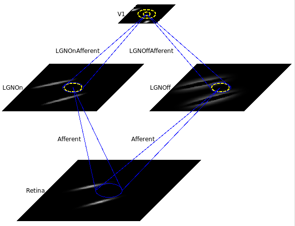
This small orientation map simulation should load in a few seconds, with a 78x78 retina, a 60x60 LGN (composed of one 60x60 OFF channel sheet, and one 60x60 ON channel sheet), and a 48x48 V1 with about two million synaptic weights.
The model architecture is shown below:
We now define the four sheet names for later reference:
In [ ]:


sheets = ['Retina','LGNOn','LGNOff','V1']
We will now define a test pattern to present to the network:
In [ ]:


test_pattern = imagen.Line()
test_pattern[:]
This shows the Line pattern with unit bounds (-0.5 to 0.5 in sheet coordinates) with a high sampling density used for display in the notebook. Here is the response to this particular test stimuli after this pattern is installed on the retinal sheet and presented to the network:
In [ ]:


response = measure_response(inputs=['Retina'], outputs=sheets, pattern_generator=test_pattern)
response.LineResponse.grid(ordering=sheets)
This shows the response for each neural area. For these plots, you can see the sheet coordinates along the x and y axes whereas the position of the array values is expressed in matrix coordinates. Note that the retinal sheet of the model has a larger bounds and a lower density than used for pattern display above, which explains why the line appears thinner and more coarsely sampled.
In the Retina plot, each photoreceptor is represented as a pixel whose shade of gray codes the response level. Similarly, locations in the LGN that have an OFF or ON cell response to this pattern are shown in the LGNOff and LGNOn plots. At this stage the response level in V1 is also coded in shades of gray.
From these plots, you can see that the single line presented on the retina is edge-detected in the LGN, with ON LGN cells responding to areas brighter than their surround, and OFF LGN cells responding to areas darker than their surround. In V1, the response is patchy, as explained below.
The plots above show the spatial pattern of activity in the different sheets but do not show the absolute activity values. The best way to determine the absolute activity levels is to first get a handle on the raw activity array:
In [ ]:


activity_array = response.LineResponse.V1.last.data
Now it is easy to examine the various statistics of the activity array:
In [ ]:


activity_info = activity_array.min(), activity_array.max(), activity_array.mean(), activity_array.std()
print "V1 Activity statistics -  min: %.3f, max %.3f, mean %.3f, std %.3f" % activity_info
To help understand the response patterns in V1, we can look at the weights to V1 neurons. These weights were learned previously, as a result of presenting 10000 pairs of oriented Gaussian patterns at random angles and positions. Here are the synaptic strengths of connections to the neuron close to the center of the cortex for all the different incoming projections:
In [ ]:


coord = (0,0.1) # Close to the center of V1
(topo.sim.V1.LGNOffAfferent.view(*coord) + topo.sim.V1.LGNOnAfferent.view(*coord)
 + topo.sim.V1.LateralExcitatory.view(*coord) + topo.sim.V1.LateralInhibitory.view(*coord))
The plot shows the afferent weights to V1 (i.e., connections from the ON and OFF channels of the LGN), followed by the lateral excitatory and lateral inhibitory weights to that neuron from nearby neurons in V1. The afferent weights represent the retinal pattern that would most excite the neuron. For the particular neuron shown above, the optimal retinal stimulus would be a short, bright line oriented at about 35 degrees (from 7 o’clock to 1 o’clock) in the center of the retina. (Note that the particular neuron you are viewing may have a different preferred orientation.)
Note that the weights are shown on different spatial scales.
If all neurons had the same weight pattern, the response would not be patchy – it would just be a blurred version of the input (for inputs matching the weight pattern), or blank (for other inputs). Here are what the afferent connections to the other neurons look like:
In [ ]:


topo.sim.V1.LGNOnAfferent.grid() + topo.sim.V1.LGNOffAfferent.grid()
This plot shows the afferent weights from the LGN ON sheet for 20 neurons sampled in each direction. You can see that most of the neurons are selective for orientation (not just a circular spot), and each has a slightly different preferred orientation. This suggests an explanation for why the response is patchy: neurons preferring orientations other than the one present on the retina do not respond. You can also look at the LateralInhibitory weights instead of LGNOnAfferent; those are patchy as well because the typical activity patterns are patchy.
To visualize all the neurons at once in experimental animals, optical imaging experiments measure responses to a variety of patterns and record the one most effective at stimulating each neuron. This approach of recording the cortical response to particular stimuli was used to measurements the maps in the model every 1000 iterations as it was trained to a total of 20000 iterations. This data is now made easily accessible as follows:
In [ ]:


data = topo.sim.views              # The measurement data saved in the snapshot
Here is a view of the orientation preference for neurons in V1 and the corresponding map of orientation selectivity:
In [ ]:


pref_sel = (data.OrientationPreference.V1 * data.OrientationSelectivity.V1)
(data.OrientationPreference.V1 + data.OrientationSelectivity.V1 + pref_sel)
The Orientation Preference plot is the orientation map for V1 in this model. Each neuron in the plot is color coded by its preferred orientation, according to the key shown to the left of the plot.
You can see that nearby neurons have similar orientation preferences, as found in primate visual cortex. The orientation selectivity plot shows the relative selectivity of each neuron for orientation on an arbitrary scale; you can see that in this simulation nearly all neurons became orientation selective. The middle plot (the polar plot) combines orientation preference and selectivity – each neuron is colored with its preferred orientation, and the stronger the selectivity, the brighter the color. In this case, because the neurons are strongly selective, the polar preference and selectivity plot is nearly identical to the preference plot.
In [ ]:


colorized_response = operation.HCS(data.OrientationPreference.V1.last * response.LineResponse.V1, flipSC=True)
response.LineResponse.Retina + response.LineResponse.LGNOff + response.LineResponse.LGNOn + colorized_response
Each V1 neuron is now color coded by its orientation, with brighter colors indicating stronger activation.
The color coding allows us to see that the neurons responding are indeed those that prefer orientations similar to the input pattern, and that the response is patchy because other nearby neurons do not respond. To be sure of that, try using a line with a different orientation as a test stimulus – the colors should be different, and should match the orientation chosen.
In [ ]:


%%opts CFView cmap='gray'
coord = (0,0.1) # Close to the center of V1
V1_exc = operation.colorize(topo.sim.V1.LateralExcitatory.view(*coord, situated=True)
                             * data.OrientationPreference.V1.last)
V1_inh = operation.colorize(topo.sim.V1.LateralInhibitory.view(*coord, situated=True)
                             * data.OrientationPreference.V1.last)
(topo.sim.V1.LGNOffAfferent.view(*coord, situated=True)
 + topo.sim.V1.LGNOnAfferent.view(*coord, situated=True) + V1_exc + V1_inh)
Look at the LateralExcitatory weights, which show that the neurons near the above neuron are nearly all yellow-green, to match its preferred orientation.
Note that the weights are now shown in grayscale so the only color corresponds to the orientation color key.
Now let's have a look at the activity using a vertical line as a test stimulus:
In [ ]:


test_pattern = imagen.Line(orientation=math.pi/2)
response = measure_response(inputs=['Retina'], outputs=sheets, pattern_generator=test_pattern)
colorized_response = operation.HCS(data.OrientationPreference.V1.last * response.LineResponse.V1, flipSC=True)
response.LineResponse.Retina + response.LineResponse.LGNOff + response.LineResponse.LGNOn + colorized_response
In [ ]:


%%opts CFView cmap='gray'
coord = (0,0.2) # A coordinate of a unit in the green path
V1_exc = operation.colorize(topo.sim.V1.LateralExcitatory.view(*coord, situated=True)
                             * data.OrientationPreference.V1.last)
V1_inh = operation.colorize(topo.sim.V1.LateralInhibitory.view(*coord, situated=True)
                             * data.OrientationPreference.V1.last)
(topo.sim.V1.LGNOffAfferent.view(*coord, situated=True)
 + topo.sim.V1.LGNOnAfferent.view(*coord, situated=True) + V1_exc + V1_inh)
As another example, an interesting property of orientation maps measured in animals is that their Fourier power spectrums usually show a ring shape, because the orientations repeat at a constant spatial frequency in all directions.
In [ ]:


fft = imagen.analysis.fft_power_spectrum(data.OrientationPreference.V1)
fft.last
We have already seen one example of how to change the test stimulus when we presented a vertical line to the network. Note that imagen.Line is only one of many different types of pattern that can be presented to the network. Here are some commonly used test stimuli:
imagen.Gaussianimagen.Diskimagen.Gaborimagen.SineGratingimagen.image.FileImageimagen.Arcimagen.Ringimagen.RectangleFor a more complete list of available patterns, type imagen. into a code cell and press TAB.
Common pattern parameters:
Note: how this model is insensitive to the scale; the response remains orientation selective even as the scale is varied substantially. (If you try the lissom_oo_or tutorial, you can see the effect of contrast gain control operating in this model.)
As we have seen, a vertical line can be obtained by setting the orientation parameter for a Line to $\frac{\pi}{2}$ radians. Here is a different example, showing a SineGrating oriented at a 45$^o$ angle:
In [ ]:


imagen.SineGrating(orientation=math.pi/4)[:]
You can also view more about the different possible parameters of a test pattern using the %params magic as follows:
In [ ]:


%params test_pattern
In the live notebook environment, this will open up a pane with details about all the available parameters for the pattern.
To present photographs, select a Pattern generator of type
imagen.image.FileImage. For most photographs, you will probably
want to enlarge the image size to look at details. Here is an example
of how a file image can be loaded and displayed:
In [ ]:


filename = param.resolve_path('images/ellen_arthur.pgm')
scale = 2.0 if model == 'LISSOM' else 1.0
test_pattern = imagen.image.FileImage(filename=filename, scale=scale)
test_pattern[:]
Note that the scale needs to be boosted to make the network respond in the LISSOM model whereas the scale doesn't need to be adjusted for the GCAL model. This is due to the contrast gain-control mechanism that operates in the LGN sheets of the GCAL model.
A much larger, more complicated, and slower map would be required to see interesting patterns in the response to most images, but even with this network you may be able to see some orientation-specific responses to large contours in the image:
In [ ]:


response = measure_response(inputs=['Retina'], outputs=sheets, pattern_generator=test_pattern)
colorized_response = operation.HCS(data.OrientationPreference.V1.last * response.FileImageResponse.V1, flipSC=True)
(response.FileImageResponse.Retina + response.FileImageResponse.LGNOff
 + response.FileImageResponse.LGNOn + colorized_response)
Note that the axes have very different limits between the different
sheets. The Retina sheet extends past 1.5 units in sheet
Coordinates
whereas the V1 sheet reaches only 0.5 units in sheet coordinates
in each direction. The reason for these differences is that in this
particular network, the Retina and LGN stages each have an extra
“buffer” region around the outside so that no V1 neuron will have its
CF cut off, and the result is that V1 sees only the central region of
the image in the LGN, and the LGN sees only the central region of the
retina.
Here is an animation showing the preference, selectivity and combined preference/selectivity plots over development (top row). The bottom row show the FFT of the preference map and the Center of Gravity plots for the LGN ON and OFF projections.
In [ ]:


(data.OrientationPreference.V1 + data.OrientationSelectivity.V1 + pref_sel
+ fft + data.CoG.LGNOnAfferent + data.CoG.LGNOffAfferent).cols(3)