Due Thursday, Oct 3, 11:59 PM
In HW1, we explored how to make predictions (with uncertainties) about upcoming elections based on the Real Clear Politics poll. This assignment also focuses on election prediction, but we are going to implement and evaluate a number of more sophisticated forecasting techniques.
We are going to focus on the 2012 Presidential election. Analysts like Nate Silver, Drew Linzer, and Sam Wang developed highly accurate models that correctly forecasted most or all of the election outcomes in each of the 50 states. We will explore how hard it is to recreate similarly successful models. The goals of this assignment are:
The data for our analysis will come from demographic and polling data. We will simulate building our model on October 2, 2012 -- approximately one month before the election.
The questions in this assignment are numbered. The questions are also usually italicised, to help you find them in the flow of this notebook. At some points you will be asked to write functions to carry out certain tasks. Its worth reading a little ahead to see how the function whose body you will fill in will be used.
This is a long homework. Please do not wait until the last minute to start it!
The data for this homework can be found at this link. Download it to the same folder where you are running this notebook, and uncompress it. You should find the following files there:
In [1]:


%matplotlib inline
from collections import defaultdict
import json

import numpy as np
import matplotlib.pyplot as plt
import pandas as pd

from matplotlib import rcParams
import matplotlib.cm as cm
import matplotlib as mpl

#colorbrewer2 Dark2 qualitative color table
dark2_colors = [(0.10588235294117647, 0.6196078431372549, 0.4666666666666667),
                (0.8509803921568627, 0.37254901960784315, 0.00784313725490196),
                (0.4588235294117647, 0.4392156862745098, 0.7019607843137254),
                (0.9058823529411765, 0.1607843137254902, 0.5411764705882353),
                (0.4, 0.6509803921568628, 0.11764705882352941),
                (0.9019607843137255, 0.6705882352941176, 0.00784313725490196),
                (0.6509803921568628, 0.4627450980392157, 0.11372549019607843)]

rcParams['figure.figsize'] = (10, 6)
rcParams['figure.dpi'] = 150
rcParams['axes.color_cycle'] = dark2_colors
rcParams['lines.linewidth'] = 2
rcParams['axes.facecolor'] = 'white'
rcParams['font.size'] = 14
rcParams['patch.edgecolor'] = 'white'
rcParams['patch.facecolor'] = dark2_colors[0]
rcParams['font.family'] = 'StixGeneral'


def remove_border(axes=None, top=False, right=False, left=True, bottom=True):
    """
    Minimize chartjunk by stripping out unnecesasry plot borders and axis ticks

    The top/right/left/bottom keywords toggle whether the corresponding plot border is drawn
    """
    ax = axes or plt.gca()
    ax.spines['top'].set_visible(top)
    ax.spines['right'].set_visible(right)
    ax.spines['left'].set_visible(left)
    ax.spines['bottom'].set_visible(bottom)

    #turn off all ticks
    ax.yaxis.set_ticks_position('none')
    ax.xaxis.set_ticks_position('none')

    #now re-enable visibles
    if top:
        ax.xaxis.tick_top()
    if bottom:
        ax.xaxis.tick_bottom()
    if left:
        ax.yaxis.tick_left()
    if right:
        ax.yaxis.tick_right()

pd.set_option('display.width', 500)
pd.set_option('display.max_columns', 100)
In [2]:


#this mapping between states and abbreviations will come in handy later
states_abbrev = {
        'AK': 'Alaska',
        'AL': 'Alabama',
        'AR': 'Arkansas',
        'AS': 'American Samoa',
        'AZ': 'Arizona',
        'CA': 'California',
        'CO': 'Colorado',
        'CT': 'Connecticut',
        'DC': 'District of Columbia',
        'DE': 'Delaware',
        'FL': 'Florida',
        'GA': 'Georgia',
        'GU': 'Guam',
        'HI': 'Hawaii',
        'IA': 'Iowa',
        'ID': 'Idaho',
        'IL': 'Illinois',
        'IN': 'Indiana',
        'KS': 'Kansas',
        'KY': 'Kentucky',
        'LA': 'Louisiana',
        'MA': 'Massachusetts',
        'MD': 'Maryland',
        'ME': 'Maine',
        'MI': 'Michigan',
        'MN': 'Minnesota',
        'MO': 'Missouri',
        'MP': 'Northern Mariana Islands',
        'MS': 'Mississippi',
        'MT': 'Montana',
        'NA': 'National',
        'NC': 'North Carolina',
        'ND': 'North Dakota',
        'NE': 'Nebraska',
        'NH': 'New Hampshire',
        'NJ': 'New Jersey',
        'NM': 'New Mexico',
        'NV': 'Nevada',
        'NY': 'New York',
        'OH': 'Ohio',
        'OK': 'Oklahoma',
        'OR': 'Oregon',
        'PA': 'Pennsylvania',
        'PR': 'Puerto Rico',
        'RI': 'Rhode Island',
        'SC': 'South Carolina',
        'SD': 'South Dakota',
        'TN': 'Tennessee',
        'TX': 'Texas',
        'UT': 'Utah',
        'VA': 'Virginia',
        'VI': 'Virgin Islands',
        'VT': 'Vermont',
        'WA': 'Washington',
        'WI': 'Wisconsin',
        'WV': 'West Virginia',
        'WY': 'Wyoming'
}
Here is some code to plot State Chloropleth maps in matplotlib. make_map is the function you will use.
In [3]:


#adapted from  https://github.com/dataiap/dataiap/blob/master/resources/util/map_util.py

#load in state geometry
state2poly = defaultdict(list)

data = json.load(file("data/us-states.json"))
for f in data['features']:
    state = states_abbrev[f['id']]
    geo = f['geometry']
    if geo['type'] == 'Polygon':
        for coords in geo['coordinates']:
            state2poly[state].append(coords)
    elif geo['type'] == 'MultiPolygon':
        for polygon in geo['coordinates']:
            state2poly[state].extend(polygon)


def draw_state(plot, stateid, **kwargs):
    """
    draw_state(plot, stateid, color=..., **kwargs)

    Automatically draws a filled shape representing the state in
    subplot.
    The color keyword argument specifies the fill color.  It accepts keyword
    arguments that plot() accepts
    """
    for polygon in state2poly[stateid]:
        xs, ys = zip(*polygon)
        plot.fill(xs, ys, **kwargs)


def make_map(states, label):
    """
    Draw a cloropleth map, that maps data onto the United States

    Inputs
    -------
    states : Column of a DataFrame
        The value for each state, to display on a map
    label : str
        Label of the color bar

    Returns
    --------
    The map
    """
    fig = plt.figure(figsize=(12, 9))
    ax = plt.gca()

    if states.max() < 2: # colormap for election probabilities
        cmap = cm.RdBu
        vmin, vmax = 0, 1
    else:  # colormap for electoral votes
        cmap = cm.binary
        vmin, vmax = 0, states.max()
    norm = mpl.colors.Normalize(vmin=vmin, vmax=vmax)

    skip = set(['National', 'District of Columbia', 'Guam', 'Puerto Rico',
                'Virgin Islands', 'American Samoa', 'Northern Mariana Islands'])
    for state in states_abbrev.values():
        if state in skip:
            continue
        color = cmap(norm(states.ix[state]))
        draw_state(ax, state, color = color, ec='k')

    #add an inset colorbar
    ax1 = fig.add_axes([0.45, 0.70, 0.4, 0.02])
    cb1=mpl.colorbar.ColorbarBase(ax1, cmap=cmap,
                                  norm=norm,
                                  orientation='horizontal')
    ax1.set_title(label)
    remove_border(ax, left=False, bottom=False)
    ax.set_xticks([])
    ax.set_yticks([])
    ax.set_xlim(-180, -60)
    ax.set_ylim(15, 75)
    return ax
In [4]:


# We are pretending to build our model 1 month before the election
import datetime
today = datetime.datetime(2012, 10, 2)
today
Out[4]:
US Presidential elections revolve around the Electoral College . In this system, each state receives a number of Electoral College votes depending on it's population -- there are 538 votes in total. In most states, all of the electoral college votes are awarded to the presidential candidate who recieves the most votes in that state. A candidate needs 269 votes to be elected President.
Thus, to calculate the total number of votes a candidate gets in the election, we add the electoral college votes in the states that he or she wins. (This is not entirely true, with Nebraska and Maine splitting their electoral college votes, but, for the purposes of this homework, we shall assume that the winner of the most votes in Maine and Nebraska gets ALL the electoral college votes there.)
Here is the electoral vote breakdown by state:
As a matter of convention, we will index all our dataframes by the state name
In [5]:


electoral_votes = pd.read_csv("data/electoral_votes.csv").set_index('State')
electoral_votes.head(50)
Out[5]:
To illustrate the use of make_map we plot the Electoral College
In [6]:


make_map(electoral_votes.Votes, "Electoral Votes");
We will start by examining a successful forecast that PredictWise made on October 2, 2012. This will give us a point of comparison for our own forecast models.
PredictWise aggregated polling data and, for each state, estimated the probability that the Obama or Romney would win. Here are those estimated probabilities:
In [7]:


predictwise = pd.read_csv('data/predictwise.csv').set_index('States')
predictwise.head(10)
Out[7]:
1.1 Each row is the probability predicted by Predictwise that Romney or Obama would win a state. The votes column lists the number of electoral college votes in that state. Use make_map to plot a map of the probability that Obama wins each state, according to this prediction.
In [8]:


#your code here
make_map(predictwise.Obama, "Probability of Obama Winning");
Later on in this homework we will explore some approaches to estimating probabilities like these and quatifying our uncertainty about them. But for the time being, we will focus on how to make a prediction assuming these probabilities are known.
Even when we assume the win probabilities in each state are known, there is still uncertainty left in the election. We will use simulations from a simple probabilistic model to characterize this uncertainty. From these simulations, we will be able to make a prediction about the expected outcome of the election, and make a statement about how sure we are about it.
1.2 We will assume that the outcome in each state is the result of an independent coin flip whose probability of coming up Obama is given by a Dataframe of state-wise win probabilities. Write a function that uses this predictive model to simulate the outcome of the election given a Dataframe of probabilities.
In [9]:


"""
Function
--------
simulate_election

Inputs
------
model : DataFrame
    A DataFrame summarizing an election forecast. The dataframe has 51 rows -- one for each state and DC
    It has the following columns:
       Obama : Forecasted probability that Obama wins the state
       Votes : Electoral votes for the state
    The DataFrame is indexed by state (i.e., model.index is an array of state names)

n_sim : int
   Number of simulations to run

Returns
-------
results : Numpy array with n_sim elements
   Each element stores the number of electoral college votes Obama wins in each simulation.
"""

#Your code here
def simulate_election(model, n_sim):
    simulations = np.random.uniform(size= (51,n_sim))
    obama_votes = (simulations < model.Obama.values.reshape(-1,1))* model.Votes.values.reshape(-1,1)
    results  = obama_votes.sum(axis = 0)
    return results
The following cells takes the necessary DataFrame for the Predictwise data, and runs 10000 simulations. We use the results to compute the probability, according to this predictive model, that Obama wins the election (i.e., the probability that he receives 269 or more electoral college votes)
In [10]:


result = simulate_election(predictwise, 10000)
result
Out[10]:
In [11]:


#compute the probability of an Obama win, given this simulation
#Your code here
print (result >=269).mean()
1.3 Now, write a function called plot_simulation to visualize the simulation. This function should:
In [72]:


"""
Function
--------
plot_simulation

Inputs
------
simulation: Numpy array with n_sim (see simulate_election) elements
   Each element stores the number of electoral college votes Obama wins in each simulation.

Returns
-------
Nothing
"""

#your code here
def plot_simulation(simulation):
    plt.hist(simulation, bins=np.arange(200, 538, 1),
             label='simulations', align='left', normed=True)
    plt.axvline(332, 0, .5, color='r', label='Actual Outcome')
    plt.axvline(269, 0, .5, color='k', label='Victory Threshold')
    p05 = np.percentile(simulation, 5.)
    p95 = np.percentile(simulation, 95.)
    iq = int(p95 - p05)
    pwin = ((simulation >= 269).mean() * 100)
    plt.title("Chance of Obama Victory: %0.2f%%, Spread: %d votes" % (pwin, iq))
    plt.legend(frameon=False, loc='upper left')
    plt.xlabel("Obama Electoral College Votes")
    plt.ylabel("Probability")
    remove_border()
Lets plot the result of the Predictwise simulation. Your plot should look something like this:
In [168]:


plot_simulation(result)
plt.xlim(240,380)
Out[168]:
The point of creating a probabilistic predictive model is to simultaneously make a forecast and give an estimate of how certain we are about it.
However, in order to trust our prediction or our reported level of uncertainty, the model needs to be correct. We say a model is correct if it honestly accounts for all of the mechanisms of variation in the system we're forecasting.
In this section, we evaluate our prediction to get a sense of how useful it is, and we validate the predictive model by comparing it to real data.
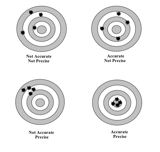
1.4 Suppose that we believe the model is correct. Under this assumption, we can evaluate our prediction by characterizing its accuracy and precision (see here for an illustration of these ideas). What does the above plot reveal about the accuracy and precision of the PredictWise model?
Your Answer Here
1.5 Unfortunately, we can never be absolutely sure that a model is correct, just as we can never be absolutely sure that the sun will rise tomorrow. But we can test a model by making predictions assuming that it is true and comparing it to real events -- this constitutes a hypothesis test. After testing a large number of predictions, if we find no evidence that says the model is wrong, we can have some degree of confidence that the model is right (the same reason we're still quite confident about the sun being here tomorrow). We call this process model checking, and use it to validate our model.
Describe how the graph provides one way of checking whether the prediction model is correct. How many predictions have we checked in this case? How could we increase our confidence in the model's correctness?
Your Answer Here
Now we will try to estimate our own win probabilities to plug into our predictive model.
We will start with a simple forecast model. We will try to predict the outcome of the election based the estimated proportion of people in each state who identify with one one political party or the other.
Gallup measures the political leaning of each state, based on asking random people which party they identify or affiliate with. Here's the data they collected from January-June of 2012:
In [14]:


gallup_2012=pd.read_csv("data/g12.csv").set_index('State')
gallup_2012["Unknown"] = 100 - gallup_2012.Democrat - gallup_2012.Republican
gallup_2012.head()
Out[14]:
Each row lists a state, the percent of surveyed individuals who identify as Democrat/Republican, the percent whose identification is unknown or who haven't made an affiliation yet, the margin between Democrats and Republicans (Dem_Adv: the percentage identifying as Democrats minus the percentage identifying as Republicans), and the number N of people surveyed.
1.6 This survey can be used to predict the outcome of each State's election. The simplest forecast model assigns 100% probability that the state will vote for the majority party. Implement this simple forecast.
In [15]:


"""
Function
--------
simple_gallup_model

A simple forecast that predicts an Obama (Democratic) victory with
0 or 100% probability, depending on whether a state
leans Republican or Democrat.

Inputs
------
gallup : DataFrame
    The Gallup dataframe above

Returns
-------
model : DataFrame
    A dataframe with the following column
     * Obama: probability that the state votes for Obama. All values should be 0 or 1
    model.index should be set to gallup.index (that is, it should be indexed by state name)

Examples
---------
>>> simple_gallup_model(gallup_2012).ix['Florida']
Obama    1
Name: Florida, dtype: float64
>>> simple_gallup_model(gallup_2012).ix['Arizona']
Obama    0
Name: Arizona, dtype: float64
"""

#your code here
def simple_gallup_model(gallup):
    return pd.DataFrame(dict(Obama=(gallup_2012.Dem_Adv > 0).astype(float)))
Now, we run the simulation with this model, and plot it.
In [16]:


model = simple_gallup_model(gallup_2012)
model = model.join(electoral_votes)

prediction = simulate_election(model, 10000)

plot_simulation(prediction)
plt.show()
make_map(model.Obama, "P(Obama): Simple Model")
Out[16]:
1.7 Attempt to validate the predictive model using the above simulation histogram. Does the evidence contradict the predictive model?
Predictive model suggests zero probability for the actual outcome(in red). This contradicts the evidence and hence we should reject the preditive model.
The model above is brittle -- it includes no accounting for uncertainty, and thus makes predictions with 100% confidence. This is clearly wrong -- there are numerous sources of uncertainty in estimating election outcomes from a poll of affiliations.
The most obvious source of error in the Gallup data is the finite sample size -- Gallup did not poll everybody in America, and thus the party affilitions are subject to sampling errors. How much uncertainty does this introduce?
On their webpage discussing these data, Gallup notes that the sampling error for the states is between 3 and 6%, with it being 3% for most states. (The calculation of the sampling error itself is an exercise in statistics. Its fun to think of how you could arrive at the sampling error if it was not given to you. One way to do it would be to assume this was a two-choice situation and use binomial sampling error for the non-unknown answers, and further model the error for those who answered 'Unknown'.)
1.8 Use Gallup's estimate of 3% to build a Gallup model with some uncertainty. Assume that the Dem_Adv column represents the mean of a Gaussian, whose standard deviation is 3%. Build the model in the function uncertain_gallup_model. Return a forecast where the probability of an Obama victory is given by the probability that a sample from the Dem_Adv Gaussian is positive.
Hint The probability that a sample from a Gaussian with mean $\mu$ and standard deviation $\sigma$ exceeds a threhold $z$ can be found using the the Cumulative Distribution Function of a Gaussian:
$$ CDF(z) = \frac1{2}\left(1 + {\rm erf}\left(\frac{z - \mu}{\sqrt{2 \sigma^2}}\right)\right) $$
In [17]:


"""
Function
--------
uncertain_gallup_model

A forecast that predicts an Obama (Democratic) victory if the random variable drawn
from a Gaussian with mean Dem_Adv and standard deviation 3% is >0

Inputs
------
gallup : DataFrame
    The Gallup dataframe above

Returns
-------
model : DataFrame
    A dataframe with the following column
     * Obama: probability that the state votes for Obama.
    model.index should be set to gallup.index (that is, it should be indexed by state name)
"""
# your code here
from scipy.special import erf
def uncertain_gallup_model(gallup):
    sigma = 3.0
    prob = 0.5*(1 + erf(gallup.Dem_Adv/np.sqrt(2*sigma**2)))
    return pd.DataFrame(dict(Obama= prob), index =gallup.index)
We construct the model by estimating the probabilities:
In [67]:


model = uncertain_gallup_model(gallup_2012)
model = model.join(electoral_votes)
Once again, we plot a map of these probabilities, run the simulation, and display the results
In [133]:


make_map(model.Obama, "P(Obama): Gallup + Uncertainty")
plt.show()
prediction = simulate_election(model, 10000)
plot_simulation(prediction)
plt.xlim(150,350)
Out[133]:
1.9 Attempt to validate the above model using the histogram. Does the predictive distribution appear to be consistent with the real data? Comment on the accuracy and precision of the prediction.
Your answers here
While accounting for uncertainty is one important part of making predictions, we also want to avoid systematic errors. We call systematic over- or under-estimation of an unknown quantity bias. In the case of this forecast, our predictions would be biased if the estimates from this poll systematically over- or under-estimate vote proportions on election day. There are several reasons this might happen:
One way to account for bias is to calibrate our model by estimating the bias and adjusting for it. Before we do this, let's explore how sensitive our prediction is to bias.
1.10 Implement a biased_gallup forecast, which assumes the vote share for the Democrat on election day will be equal to Dem_Adv shifted by a fixed negative amount. We will call this shift the "bias", so a bias of 1% means that the expected vote share on election day is Dem_Adv-1.
Hint You can do this by wrapping the uncertain_gallup_model in a function that modifies its inputs.
In [20]:


"""
Function
--------
biased_gallup_poll

Subtracts a fixed amount from Dem_Adv, beofore computing the uncertain_gallup_model.
This simulates correcting a hypothetical bias towards Democrats
in the original Gallup data.

Inputs
-------
gallup : DataFrame
    The Gallup party affiliation data frame above
bias : float
    The amount by which to shift each prediction

Examples
--------
>>> model = biased_gallup(gallup, 1.)
>>> model.ix['Flordia']
>>> .460172
"""
#your code here
def biased_gallup_poll(gallup, bias):
    g2 = gallup.copy()
    g2.Dem_Adv -= bias
    return uncertain_gallup_model(g2)
1.11 Simulate elections assuming a bias of 1% and 5%, and plot histograms for each one.
In [131]:


#your code here
model = biased_gallup_poll(gallup_2012, 1)
model = model.join(electoral_votes)
prediction = simulate_election(model, 10000)
plot_simulation(prediction)
plt.show()


model = biased_gallup_poll(gallup_2012, 5)
model = model.join(electoral_votes)
prediction = simulate_election(model, 10000)
plot_simulation(prediction)
plt.show()
Note that even a small bias can have a dramatic effect on the predictions. Pundits made a big fuss about bias during the last election, and for good reason -- it's an important effect, and the models are clearly sensitive to it. Forecastors like Nate Silver would have had an easier time convincing a wide audience about their methodology if bias wasn't an issue.
Furthermore, because of the nature of the electoral college, biases get blown up large. For example, suppose you mis-predict the party Florida elects. We've possibly done this as a nation in the past :-). Thats 29 votes right there. So, the penalty for even one misprediction is high.
While bias can lead to serious inaccuracy in our predictions, it is fairly easy to correct if we are able to estimate the size of the bias and adjust for it. This is one form of calibration.
One approach to calibrating a model is to use historical data to estimate the bias of a prediction model. We can use our same prediction model on historical data and compare our historical predictions to what actually occurred and see if, on average, the predictions missed the truth by a certain amount. Under some assumptions (discussed in a question below), we can use the estimate of the bias to adjust our current forecast.
In this case, we can use data from the 2008 election. (The Gallup data from 2008 are from the whole of 2008, including after the election):
In [22]:


gallup_08 = pd.read_csv("data/g08.csv").set_index('State')
results_08 = pd.read_csv('data/2008results.csv').set_index('State')
prediction_08 = gallup_08[['Dem_Adv']]
prediction_08['Dem_Win']=results_08["Obama Pct"] - results_08["McCain Pct"]
prediction_08.head()
Out[22]:
1.12 Make a scatter plot using the prediction_08 dataframe of the democratic advantage in the 2008 Gallup poll (X axis) compared to the democratic win percentage -- the difference between Obama and McCain's vote percentage -- in the election (Y Axis). Overplot a linear fit to these data.
Hint
The np.polyfit function can compute linear fits, as can sklearn.linear_model.LinearModel
In [23]:


#your code here
plt.plot(prediction_08.Dem_Adv,prediction_08.Dem_Win, 'o');
plt.xlabel('Democratic Advantage in 2008');
plt.ylabel('Democratic Win in 2008');
plt.title('Democratic Advantage vs Win in 2008');

#plot fit
fit = np.polyfit(prediction_08.Dem_Adv,prediction_08.Dem_Win,1 )
x = np.linspace(-40,80,10)
y = np.polyval(fit,x)
plt.plot(x, x, '--k', alpha=.3, label='x=y')
plt.plot(x,y)
print fit
Notice that a lot of states in which Gallup reported a Democratic affiliation, the results were strongly in the opposite direction. Why might that be? You can read more about the reasons for this here.
A quick look at the graph will show you a number of states where Gallup showed a Democratic advantage, but where the elections were lost by the democrats. Use Pandas to list these states.
In [24]:


#your code here
prediction_08[(prediction_08.Dem_Adv > 0) & (prediction_08.Dem_Win <0)]
Out[24]:
We compute the average difference between the Democrat advantages in the election and Gallup poll
In [25]:


print (prediction_08.Dem_Adv - prediction_08.Dem_Win).mean()
The bias was roughly 8% in favor of the Democrats in the Gallup Poll, meaning that you would want to adjust predictions based on this poll down by that amount. This was the result of people in a number of Southern and Western states claiming to be affiliated as Democrats, then voting the other way. Or, since Gallup kept polling even after the elections, it could also represent people swept away by the 2008 election euphoria in those states. This is an illustration of why one needs to be carefull with polls.
1.13 Calibrate your forecast of the 2012 election using the estimated bias from 2008. Validate the resulting model against the real 2012 outcome. Did the calibration help or hurt your prediction?
In [128]:


#your code here
model = biased_gallup_poll(gallup_2012, 8.06 )
model = model.join(electoral_votes)
prediction = simulate_election(model, 10000)
plot_simulation(prediction)
plt.xlim(150,350)
Out[128]:
1.14 Finally, given that we know the actual outcome of the 2012 race, and what you saw from the 2008 race would you trust the results of the an election forecast based on the 2012 Gallup party affiliation poll?
This was a disaster. The 8% calibration completey destroys the accuracy of our prediction in 2012. Our calibration made the assumptions that a) the bias in 2008 was the same as 2012, and b) the bias in each state was the same. There are several ways in which these assumptions may have been violated. Gallup may have changed their methodology to account for this bias already, leading to a different bias in 2012 from what there was in 2008. The state-by-state biases may have also been different -- voters in highly conservative states may have responded to polls differently from voters in libreral states, for instance. It might have been better to callibrate the bias on a state-wide or clustered basis.
In the previous forecast, we used the strategy of taking some side-information about an election (the partisan affiliation poll) and relating that to the predicted outcome of the election. We tied these two quantities together using a very simplistic assumption, namely that the vote outcome is deterministically related to estimated partisan affiliation.
In this section, we use a more sophisticated approach to link side information -- usually called features or predictors -- to our prediction. This approach has several advantages, including the fact that we may use multiple features to perform our predictions. Such data may include demographic data, exit poll data, and data from previous elections.
First, we'll construct a new feature called PVI, and use it and the Gallup poll to build predictions. Then, we'll use logistic regression to estimate win probabilities, and use these probabilities to build a prediction.
The Partisan Voting Index (PVI) is defined as the excessive swing towards a party in the previous election in a given state. In other words:
$$ PVI_{2008} (state) = Democratic.Percent_{2004} ( state ) - Republican.Percent_{2004} ( state) - \\ \Big ( Democratic.Percent_{2004} (national) - Republican.Percent_{2004} (national) \Big ) $$To calculate it, let us first load the national percent results for republicans and democrats in the last 3 elections and convert it to the usual democratic - republican format.
In [27]:


national_results=pd.read_csv("data/nat.csv")
national_results.set_index('Year',inplace=True)
national_results.head()
Out[27]:
Let us also load in data about the 2004 elections from p04.csv which gets the results in the above form for the 2004 election for each state.
In [28]:


polls04=pd.read_csv("data/p04.csv")
polls04.State=polls04.State.replace(states_abbrev)
polls04.set_index("State", inplace=True);
polls04.head()
Out[28]:
In [29]:


pvi08=polls04.Dem - polls04.Rep - (national_results.xs(2004)['Dem'] - national_results.xs(2004)['Rep'])
pvi08.head()
Out[29]:
2.1 Build a new DataFrame called e2008. The dataframe e2008 must have the following columns:
pvi08Dem_Adv which has the Democratic advantage from the frame prediction_08 of the last question with the mean subtracted outobama_win which has a 1 for each state Obama won in 2008, and 0 otherwiseDem_Win which has the 2008 election Obama percentage minus McCain percentage, also from the frame prediction_08
In [60]:


#your code here
e2008 = pd.DataFrame(dict(pvi=pvi08,Dem_Adv = (prediction_08.Dem_Adv - prediction_08.Dem_Adv.mean()),
        obama_win = (prediction_08.Dem_Win > 0).astype(float), Dem_Win= prediction_08.Dem_Win))
e2008.head()
Out[60]:
We construct a similar frame for 2012, obtaining pvi using the 2008 Obama win data which we already have. There is no obama_win column since, well, our job is to predict it!
In [31]:


pvi12 = e2008.Dem_Win - (national_results.xs(2008)['Dem'] - national_results.xs(2008)['Rep'])
e2012 = pd.DataFrame(dict(pvi=pvi12, Dem_Adv=gallup_2012.Dem_Adv - gallup_2012.Dem_Adv.mean()))
e2012 = e2012.sort_index()
e2012.head()
Out[31]:
We load in the actual 2012 results so that we can compare our results to the predictions.
In [32]:


results2012 = pd.read_csv("data/2012results.csv")
results2012.set_index("State", inplace=True)
results2012 = results2012.sort_index()
results2012.head()
Out[32]:
2.2 Lets do a little exploratory data analysis. Plot a scatter plot of the two PVi's against each other. What are your findings? Is the partisan vote index relatively stable from election to election?
In [33]:


#your code here
plt.plot(e2008.pvi, e2012.pvi, 'o', label='Data')
fit = np.polyfit(e2008.pvi, e2012.pvi, 1)
x = np.linspace(-40, 80, 10)
y = np.polyval(fit, x)
plt.plot(x, x, '--k', alpha=.3, label='x=y')
plt.plot(x, y, label='Linear fit')
plt.xlabel('2008 Partisan Vote Index (PVI)');
plt.ylabel('2012 Partisan Vote Index (PVI)');
plt.title('PVI 2008 vs PVI 2012');
plt.legend(loc='upper left')
Out[33]:
your answer here
2.3 Lets do a bit more exploratory data analysis. Using a scatter plot, plot Dem_Adv against pvi in both 2008 and 2012. Use colors red and blue depending upon obama_win for the 2008 data points. Plot the 2012 data using gray color. Is there the possibility of making a linear separation (line of separation) between the red and the blue points on the graph?
In [34]:


#your code here
plt.xlabel('Gallup Democrat Advantage (from  mean)')
plt.ylabel('pvi')
colors = ["red","blue"]
axes = plt.gca()
for label in [0,1]:
    color = colors[label]
    mask = e2008.obama_win == label
    l = '2008 Mc Cain States' if label == 0 else '2008 Obama States'
    axes.scatter(e2008[mask]['Dem_Adv'], e2008[mask]['pvi'], c= color, s =80, label =l)
axes.scatter(e2012.Dem_Adv, e2012.pvi, c = 'black', s =80, marker ='s', alpha = .4)
plt.legend(frameon = False, scatterpoints = 1, loc = "upper left")
remove_border()
your answer here
Logistic regression is a probabilistic model that links observed binary data to a set of features.
Suppose that we have a set of binary (that is, taking the values 0 or 1) observations $Y_1,\cdots,Y_n$, and for each observation $Y_i$ we have a vector of features $X_i$. The logistic regression model assumes that there is some set of weights, coefficients, or parameters $\beta$, one for each feature, so that the data were generated by flipping a weighted coin whose probability of giving a 1 is given by the following equation:
$$ P(Y_i = 1) = \mathrm{logistic}(\sum \beta_i X_i), $$where
$$ \mathrm{logistic}(x) = \frac{e^x}{1+e^x}. $$When we fit a logistic regression model, we determine values for each $\beta$ that allows the model to best fit the training data we have observed (the 2008 election). Once we do this, we can use these coefficients to make predictions about data we have not yet observed (the 2012 election).
Sometimes this estimation procedure will overfit the training data yielding predictions that are difficult to generalize to unobserved data. Usually, this occurs when the magnitudes of the components of $\beta$ become too large. To prevent this, we can use a technique called regularization to make the procedure prefer parameter vectors that have smaller magnitude. We can adjust the strength of this regularization to reduce the error in our predictions.
We now write some code as technology for doing logistic regression. By the time you start doing this homework, you will have learnt the basics of logistic regression, but not all the mechanisms of cross-validation of data sets. Thus we provide here the code for you to do the logistic regression, and the accompanying cross-validation.
We first build the features from the 2008 data frame, returning y, the vector of labels, and X the feature-sample matrix where the columns are the features in order from the list featurelist, and each row is a data "point".
In [63]:


from sklearn.linear_model import LogisticRegression

def prepare_features(frame2008, featureslist):
    y= frame2008.obama_win.values
    X = frame2008[featureslist].values
    if len(X.shape) == 1:
        X = X.reshape(-1, 1)
    return y, X
We use the above function to get the label vector and feature-sample matrix for feeding to scikit-learn. We then use the usual scikit-learn incantation fit to fit a logistic regression model with regularization parameter C. The parameter C is a hyperparameter of the model, and is used to penalize too high values of the parameter co-efficients in the loss function that is minimized to perform the logistic regression. We build a new dataframe with the usual Obama column, that holds the probabilities used to make the prediction. Finally we return a tuple of the dataframe and the classifier instance, in that order.
In [53]:


def fit_logistic(frame2008, frame2012, featureslist, reg=0.0001):
    y, X = prepare_features(frame2008, featureslist)
    clf2 = LogisticRegression(C=reg)
    clf2.fit(X, y)
    X_new = frame2012[featureslist]
    obama_probs = clf2.predict_proba(X_new)[:, 1]

    df = pd.DataFrame(index=frame2012.index)
    df['Obama'] = obama_probs
    return df, clf2
We are not done yet. In order to estimate C, we perform a grid search over many C to find the best C that minimizes the loss function. For each point on that grid, we carry out a n_folds-fold cross-validation. What does this mean?
Suppose n_folds=10. Then we will repeat the fit 10 times, each time randomly choosing 50/10 ~ 5 states out as a test set, and using the remaining 45/46 as the training set. We use the average score on the test set to score each particular choice of C, and choose the one with the best performance.
In [37]:


from sklearn.grid_search import GridSearchCV

def cv_optimize(frame2008, featureslist, n_folds=10, num_p=100):
    y, X = prepare_features(frame2008, featureslist)
    clf = LogisticRegression()
    parameters = {"C": np.logspace(-4, 3, num=num_p)}
    gs = GridSearchCV(clf, param_grid=parameters, cv=n_folds)
    gs.fit(X, y)
    return gs.best_params_, gs.best_score_
Finally we write the function that we use to make our fits. It takes both the 2008 and 2012 frame as arguments, as well as the featurelist, and the number of cross-validation folds to do. It uses the above defined logistic_score to find the best-fit C, and then uses this value to return the tuple of result dataframe and classifier described above. This is the function you will be using.
In [61]:


def cv_and_fit(frame2008, frame2012, featureslist, n_folds=5):
    bp, bs = cv_optimize(frame2008, featureslist, n_folds=n_folds)
    predict, clf = fit_logistic(frame2008, frame2012, featureslist, reg=bp['C'])
    return predict, clf
2.4 *Carry out a logistic fit using the cv_and_fit function developed above. As your featurelist use the features we have: Dem_Adv and pvi.
In [65]:


#your code here

res, clf = cv_and_fit(e2008, e2012, ['Dem_Adv', 'pvi'])
predict2012_logistic = res.join(electoral_votes)
predict2012_logistic.head()
Out[65]:
2.5 As before, plot a histogram and map of the simulation results, and interpret the results in terms of accuracy and precision.
In [124]:


#code to make the histogram
#your code here

prediction_2012 = simulate_election(predict2012_logistic, 10000)
plot_simulation(prediction_2012)
plt.xlim(200,450)
Out[124]:
In [70]:


#code to make the map
#your code here
make_map(predict2012_logistic.Obama, "P(Obama): Logistic")
plt.show()
your answer here
One nice way to visualize a 2-dimensional logistic regression is to plot the probability as a function of each dimension. This shows the decision boundary -- the set of parameter values where the logistic fit yields P=0.5, and shifts between a preference for Obama or McCain/Romney.
The function below draws such a figure (it is adapted from the scikit-learn website), and overplots the data.
In [75]:


from matplotlib.colors import ListedColormap
def points_plot(e2008, e2012, clf):
    """
    e2008: The e2008 data
    e2012: The e2012 data
    clf: classifier
    """
    Xtrain = e2008[['Dem_Adv', 'pvi']].values
    Xtest = e2012[['Dem_Adv', 'pvi']].values
    ytrain = e2008['obama_win'].values == 1

    X=np.concatenate((Xtrain, Xtest))

    # evenly sampled points
    x_min, x_max = X[:, 0].min() - .5, X[:, 0].max() + .5
    y_min, y_max = X[:, 1].min() - .5, X[:, 1].max() + .5
    xx, yy = np.meshgrid(np.linspace(x_min, x_max, 50),
                         np.linspace(y_min, y_max, 50))
    plt.xlim(xx.min(), xx.max())
    plt.ylim(yy.min(), yy.max())

    #plot background colors
    ax = plt.gca()
    Z = clf.predict_proba(np.c_[xx.ravel(), yy.ravel()])[:, 1]
    Z = Z.reshape(xx.shape)
    cs = ax.contourf(xx, yy, Z, cmap='RdBu', alpha=.5)
    cs2 = ax.contour(xx, yy, Z, cmap='RdBu', alpha=.5)
    plt.clabel(cs2, fmt = '%2.1f', colors = 'k', fontsize=14)

    # Plot the 2008 points
    ax.plot(Xtrain[ytrain == 0, 0], Xtrain[ytrain == 0, 1], 'ro', label='2008 McCain')
    ax.plot(Xtrain[ytrain == 1, 0], Xtrain[ytrain == 1, 1], 'bo', label='2008 Obama')

    # and the 2012 points
    ax.scatter(Xtest[:, 0], Xtest[:, 1], c='k', marker="s", s=50, facecolors="k", alpha=.5, label='2012')
    plt.legend(loc='upper left', scatterpoints=1, numpoints=1)

    return ax
2.6 Plot your results on the classification space boundary plot. How sharp is the classification boundary, and how does this translate into accuracy and precision of the results?
In [77]:


#your code here
points_plot(e2008, e2012, clf)
plt.xlabel("Dem_Adv (from mean)")
plt.ylabel("PVI")
Out[77]:
Answer: The sharpness of the classifier boundary, as defined by the closeness of the contours near a probability of 0.5 gives us a sense of precision. Imagine that the boundary is very tight, tighter than what you can see in the graph. Then most states will be away from the 0.5 line, and the spread in the results will be less, or the precision higher. This is not the only consideration: indeed one must ask, how many states fall smack into the middle, say between 0.3 and 0.7. The more that do, the less precise the results will be, as there will be a greater number of simulations in which they will cross-over to another party.
To assess accuracy, we would have to see the actual outcome of the states in 2012. Accuracy would be a function of the number of states that end up on the "wrong" side of the 0.5 line, and how deep they end up on the wrong side. In terms of characterizing the 2008 outcomes, it seems that the classifier is quit eaccurate, with most misclassifications appearing in grey area of the classification boundary.
In the previous section, we tried to use heterogeneous side-information to build predictions of the election outcome. In this section, we switch gears to bringing together homogeneous information about the election, by aggregating different polling result together.
This approach -- used by the professional poll analysists -- involves combining many polls about the election itself. One advantage of this approach is that it addresses the problem of bias in individual polls, a problem we found difficult to deal with in problem 1. If we assume that the polls are all attempting to estimate the same quantity, any individual biases should cancel out when averaging many polls (pollsters also try to correct for known biases). This is often a better assumption than assuming constant bias between election cycles, as we did above.
The following table aggregates many of the pre-election polls available as of October 2, 2012. We are most interested in the column "obama_spread". We will clean the data for you:
In [84]:


multipoll = pd.read_csv('data/cleaned-state_data2012.csv', index_col=0)

#convert state abbreviation to full name
multipoll.State.replace(states_abbrev, inplace=True)

#convert dates from strings to date objects, and compute midpoint

multipoll.start_date = pd.to_datetime(multipoll.start_date)
multipoll.end_date = pd.to_datetime(multipoll.end_date)
multipoll['poll_date'] = multipoll.start_date + (multipoll.end_date - multipoll.start_date).values / 2

#compute the poll age relative to Oct 2, in days
multipoll['age_days'] = (today - multipoll['poll_date']).values / np.timedelta64(1, 'D')

#drop any rows with data from after oct 2
multipoll = multipoll[multipoll.age_days > 0]

#drop unneeded columns
multipoll = multipoll.drop(['Date', 'start_date', 'end_date', 'Spread'], axis=1)

#add electoral vote counts
multipoll = multipoll.join(electoral_votes, on='State')

#drop rows with missing data
multipoll.dropna()

multipoll.head()
Out[84]:
3.1 Using this data, compute a new data frame that averages the obama_spread for each state. Also compute the standard deviation of the obama_spread in each state, and the number of polls for each state.
Define a function state_average which returns this dataframe
Hint
pd.GroupBy could come in handy
In [107]:


groups = multipoll.groupby('State')
mean = groups.mean()['obama_spread']
std = groups.std()['obama_spread']
size = groups.count()['Pollster']
print std[std.isnull()]
std[std.isnull()] = 0.05 * mean[std.isnull()]

averages = pd.DataFrame(dict(N = size, poll_mean = mean, poll_std = std))
averages
Out[107]:
In [105]:


"""
Function
--------
state_average

Inputs
------
multipoll : DataFrame
   The multipoll data above

Returns
-------
averages : DataFrame
  A dataframe, indexed by State, with the following columns:
     N: Number of polls averaged together
     poll_mean: The average value for obama_spread for all polls in this state
     poll_std: The standard deviation of obama_spread

Notes
-----
For states where poll_std isn't finite (because N is too small), estimate the
poll_std value as .05 * poll_mean
"""
#your code here
def state_average(multipoll):
    groups = multipoll.groupby('State')
    mean = groups.mean()['obama_spread']
    std = groups.std()['obama_spread']
    size = groups.count()['Pollster']
    std[std.isnull()] = 0.5 * mean[std.isnull()]

    averages = pd.DataFrame(dict(N = size, poll_mean = mean, poll_std = std))
    return averages
Lets call the function on the multipoll data frame, and join it with the electoral_votes frame.
In [110]:


avg = state_average(multipoll).join(electoral_votes, how='outer')
avg.head()
Out[110]:
Some of the reddest and bluest states are not present in this data (people don't bother polling there as much). The default_missing function gives them strong Democratic/Republican advantages
In [144]:


def default_missing(results):
    red_states = ["Alabama", "Alaska", "Arkansas", "Idaho", "Wyoming"]
    blue_states = ["Delaware", "District of Columbia", "Hawaii"]
    results.ix[red_states, ["poll_mean"]] = -100.0
    results.ix[red_states, ["poll_std"]] = 0.1
    results.ix[blue_states, ["poll_mean"]] = 100.0
    results.ix[blue_states, ["poll_std"]] = 0.1
default_missing(avg)
avg
Out[144]:
3.2 Build an aggregated_poll_model function that takes the avg DataFrame as input, and returns a forecast DataFrame
in the format you've been using to simulate elections. Assume that the probability that Obama wins a state
is given by the probability that a draw from a Gaussian with $\mu=$poll_mean and $\sigma=$poll_std is positive.
In [ ]:
In [112]:


"""
Function
--------
aggregated_poll_model

Inputs
------
polls : DataFrame
   DataFrame indexed by State, with the following columns:
      poll_mean
      poll_std
      Votes

Returns
-------
A DataFrame indexed by State, with the following columns:
   Votes: Electoral votes for that state
   Obama: Estimated probability that Obama wins the state
"""
#your code here
def aggregated_poll_model(polls):
    sigma = polls.poll_std
    prob = 0.5*(1 + erf(polls.poll_mean / np.sqrt(2 * sigma ** 2)))
    return pd.DataFrame(dict(Obama = prob, Votes =polls.Votes))
3.3 Run 10,000 simulations with this model, and plot the results. Describe the results in a paragraph -- compare the methodology and the simulation outcome to the Gallup poll. Also plot the usual map of the probabilities
In [121]:


#your code here
model= aggregated_poll_model(avg)
predict_poll_aggregation = simulate_election(model, 10000)
plot_simulation(predict_poll_aggregation)
plt.xlim(250, 400)
Out[121]:
Answer: The accuracy of this poll is somewhat greater than just taking the gallup poll. This is probably because
One problem is that we treated all polls as equal. Thus a bad poll with a small sample size is given equal footing as a good poll with a large one. Thus we are introducing bias both due to individual poll biases and individual poll sampling errors.
Furthermore, we estimate the standard deviation by simply taking the spread of the percentages in the polls, without considering their individual margins of error. In the limit of very limit sampling error per poll, this might be ok. However in states with some polls with large margins of error (Kansas, for eg), this can lead to an overestimate of the standard deviation, pushing the predicted probability toward 0.5. This, in turn, can hurt precision since it increases the chance that a state will flip sides in a simulation.
In [119]:


#your code here
make_map(model.Obama, "P(Obama): Poll Aggregation")
plt.show()
Not all polls are equally valuable. A poll with a larger margin of error should not influence a forecast as heavily. Likewise, a poll further in the past is a less valuable indicator of current (or future) public opinion. For this reason, polls are often weighted when building forecasts.
A weighted estimate of Obama's advantage in a given state is given by
$$ \mu = \frac{\sum w_i \times \mu_i}{\sum w_i} $$where $\mu_i$ are individual polling measurements or a state, and $w_i$ are the weights assigned to each poll. The uncertainty on the weighted mean, assuming each measurement is independent, is given by
The estimate of the variance of $\mu$, when $\mu_i$ are unbiased estimators of $\mu$, is
$$\textrm{Var}(\mu) = \frac{1}{(\sum_i w_i)^2} \sum_{i=1}^n w_i^2 \textrm{Var}(\mu_i).$$We need to find an estimator of the variance of $\mu_i$, $Var(\mu_i)$. In the case of states that have a lot of polls, we expect the bias in $\mu$ to be negligible, and then the above formula for the variance of $\mu$ holds. However, lets take a look at the case of Kansas.
In [148]:


multipoll[multipoll.State=="Kansas"]
Out[148]:
In [ ]:
There are only two polls in the last year! And, the results in the two polls are far, very far from the mean.
Now, Kansas is a safely Republican state, so this dosent really matter, but if it were a swing state, we'd be in a pickle. We'd have no unbiased estimator of the variance in Kansas. So, to be conservative, and play it safe, we follow the same tack we did with the unweighted averaging of polls, and simply assume that the variance in a state is the square of the standard deviation of obama_spread.
This will overestimate the errors for a lot of states, but unless we do a detailed state-by-state analysis, its better to be conservative. Thus, we use:
$\textrm{Var}(\mu)$ = obama_spread.std()$^2$ .
The weights $w_i$ should combine the uncertainties from the margin of error and the age of the forecast. One such combination is:
$$ w_i = \frac1{MoE^2} \times \lambda_{\rm age} $$where
$$ \lambda_{\rm age} = 0.5^{\frac{{\rm age}}{30 ~{\rm days}}} $$This model makes a few ad-hoc assumptions:
3.4 Nevertheless, it's worth exploring how these assumptions affect the forecast model. Implement the model in the function weighted_state_average
In [ ]:
In [158]:


"""
Function
--------
weighted_state_average

Inputs
------
multipoll : DataFrame
   The multipoll data above

Returns
-------
averages : DataFrame
  A dataframe, indexed by State, with the following columns:
     N: Number of polls averaged together
     poll_mean: The average value for obama_spread for all polls in this state
     poll_std: The standard deviation of obama_spread

Notes
-----
For states where poll_std isn't finite (because N is too small), estimate the
poll_std value as .05 * poll_mean
"""

#your code here
def  weights(df):
    decay = 0.5**(df.age_days/30)
    w = decay / df.MoE ** 2
    return w

def wmean(df):
    w = weights(df)
    result = (df.obama_spread*w).sum() / w.sum()
    return result

def wsig(df):
    return df.obama_spread.std()

def weighted_state_average(multipoll):
    groups = multipoll.groupby('State')
    poll_mean = groups.apply(wmean)
    poll_std = groups.apply(wsig)
    poll_std[poll_std.isnull()] = 0.05*mean[poll_std.isnull()]
    return pd.DataFrame(dict(poll_mean = poll_mean, poll_std = poll_std))
3.5 Put this all together -- compute a new estimate of poll_mean and poll_std for each state, apply the default_missing function to handle missing rows, build a forecast with aggregated_poll_model, run 10,000 simulations, and plot the results, both as a histogram and as a map.
In [167]:


#your code here
average = weighted_state_average(multipoll).join(electoral_votes, how='outer')
default_missing(average)
model= aggregated_poll_model(average)
predict_poll_weighted = simulate_election(model, 10000)
plot_simulation(predict_poll_weighted)
plt.xlim(250, 400)
Out[167]:
In [165]:


#your map code here
make_map(model.Obama, "P(Obama): Weighted Polls")
Out[165]:
3.6 Discuss your results in terms of bias, accuracy and precision, as before
Answer: The accuracy of this poll is higher than before, primarily as a result of removing bias in the calculation of the weighted means. As per the discussion earlier, the precision is really not much better, as we use the same method to calculate the standrd deviations.
This points to the importance of getting a better grip on these standard deviations to improve the precisions of one's forecasts. Pollsters engage in trend analysis, a state by state weighting of the standard deviation, weighting pollsters, and other methods to estimate the standard deviations more accurately.
For fun, but not to hand in, play around with turning off the time decay weight and the sample error weight individually.
The models we have explored in this homework have been fairly ad-hoc. Still, we have seen predicting by simulation, prediction using heterogeneous side-features, and finally by weighting polls that are made in the election season. The pros pretty much start from poll-averaging, adding in demographics and economic information, and moving onto trend-estimation as the election gets closer. They also employ models of likely voters vs registered voters, and how independents might break. At this point, you are prepared to go and read more about these techniques, so let us leave you with some links to read:
Skipper Seabold's reconstruction of parts of Nate Silver's model: https://github.com/jseabold/538model . We've drawn direct inspiration from his work , and indeed have used some of the data he provides in his repository
The simulation techniques are partially drawn from Sam Wang's work at http://election.princeton.edu . Be sure to check out the FAQ, Methods section, and matlab code on his site.
Nate Silver, who we are still desperately seeking, has written a lot about his techniques: http://www.fivethirtyeight.com/2008/03/frequently-asked-questions-last-revised.html . Start there and look around
Drew Linzer uses bayesian techniques, check out his work at: http://votamatic.org/evaluating-the-forecasting-model/
How to submit
To submit your homework, create a folder named lastname_firstinitial_hw2 and place this notebook file in the folder. Also put the data folder in this folder. Make sure everything still works! Select Kernel->Restart Kernel to restart Python, Cell->Run All to run all cells. You shouldn't hit any errors. Compress the folder (please use .zip compression) and submit to the CS109 dropbox in the appropriate folder. If we cannot access your work because these directions are not followed correctly, we will not grade your work.
css tweaks in this cell