Next, let's look at some simple networks in NetworkX. First, we need to import the NetworkX package. If we alias it as "nx", we can save some typing:
In [ ]:


import networkx as nx  # Note "as" gives us a shorthand for accessing the components within the NetworkX package.
import random as rand
import pylab as plt
import warnings # Wakari issues some warnings due to its versions of matplotlib and networkx - let's ignore them for now.
warnings.filterwarnings("ignore")
In [ ]:


g = nx.Graph()
type(g)
And add some nodes and edges using the add_node and add_edge methods:
In [ ]:


g.add_node(1)
g.add_node(2)
g.add_node(3)
g.nodes()
In [ ]:


g.add_edge(1,2)
g.add_edge(2,3)
g.add_edge(3,1)
print g.edges()
Now let's draw it with the matplotlib and networkx libraries:
In [ ]:


pylab.rcParams['figure.figsize'] = (5.0, 5.0)  # Sets the plot output size
nx.draw(g)
plt.show()
In [ ]:


g = nx.Graph()
...and substitute state names and populations for integers:
In [ ]:


g.add_node("California", { "population": 38332521})
g.add_node("New York", { "population": 26448193})
g.add_node("Texas", { "population": 19651127})
Let's look at the new nodes:
In [ ]:


print g.nodes() # Note the data parameters tells networkx to include the node's data in the returned value.
print g.nodes(data=True) # Note the data parameters tells networkx to include the node's data in the returned value.
And we can do the same thing with edges - how about 2014 interstate migration (from
https://www.census.gov/hhes/migration/data/acs/state-to-state.html):
In [ ]:


g.add_edge('New York', 'California', { "net migration": 7171})
g.add_edge('New York', 'Texas', { "net migration": 6810 })
g.add_edge("Texas", "California", { "net migration": 34028 } )
print g.edges(data=True)
Now let's try including this information in our diagram. For more information on network drawing options, see:
https://networkx.readthedocs.org/en/stable/tutorial/tutorial.html#drawing-graphs
In [ ]:


pylab.rcParams['figure.figsize'] = (4.0, 4.0)
nx.draw(g, with_labels=True)
Adding node sizes:
In [ ]:


sizes = [n[1]["population"]/10000.0 for n in g.nodes(data=True)]
nx.draw(g, with_labels=True, node_size=sizes)
Adding line weights:
In [ ]:


widths = [m[2]["net migration"]/5000 for m in g.edges(data=True)]
nx.draw(g, with_labels=True, node_size=sizes, width=widths)
Usually NetworkX is used in combination with external data sources, both for input and for output.
For output, NetworkX supports commonly-used graph formats that can be used by software like __Gephi__, which is designed for manipulating graphs. Exporting to these formats is simply a matter of calling the applicable NetworkX function. A list of them is available here:
http://networkx.readthedocs.org/en/stable/reference/convert.html
http://networkx.readthedocs.org/en/stable/reference/readwrite.html
Here's an example of a random graph (more on this later), output to a file:
In [ ]:


g = nx.erdos_renyi_graph(10, 0.2)
nx.write_gexf(g, "my_network_file.gefx")
Let's look at the contents of the gefx format:
In [ ]:


with open('my_network_file.gefx','r') as f:
    print f.read()
Reading is then a matter of calling the corresponding read function:
In [ ]:


g2 = nx.read_gexf("my_network_file.gefx")
print [n for n in nx.generate_edgelist(g2)]
We can also use NetworkX to convert between different representations of graphs, for example:
In [ ]:


# A dictionary of dictionarys:
print nx.to_dict_of_dicts(g2)
In [ ]:


# A dictionary of lists:
print nx.to_dict_of_lists(g2)
In [ ]:


# A numpy array:
import numpy as np
print nx.to_numpy_matrix(g)
Converting to numpy matrixes exposes data embedded in networkx to further analsysis and explration via matrix operations. See Newman chapter 11 for a good introduction.
Data import works similarly if the data is already in a graph-compatible format. But, often, you may be working with tabular data, which can often be translated directly into nodes and edges.
For example, the file state_to_state.txt contains tab-delimited data on the amount of grant funding flowing between states in 2009. Let's take a look at the contents:
In [ ]:


with open('state_to_state.txt','r') as f:
    print f.read()
This is simply the result of a SQL group-by. Output from SQL queries can often be interpreted as edge lists straightforwardly. It is simply a matter of choosing which attributes are nodes, and which are edges. Typically, the nodes would be the group-by columns, and the edges would be determined by co-occurrence in the same row, and edge attributes by the results of aggregate functions.
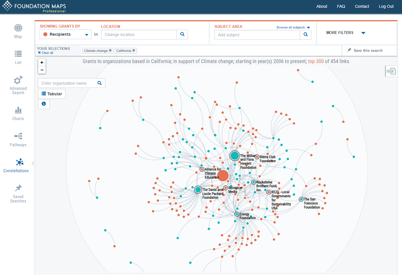
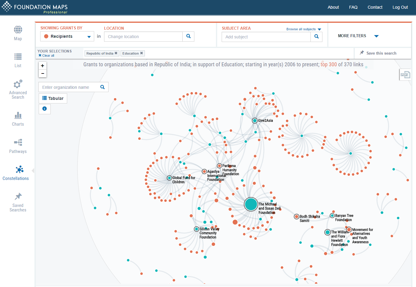
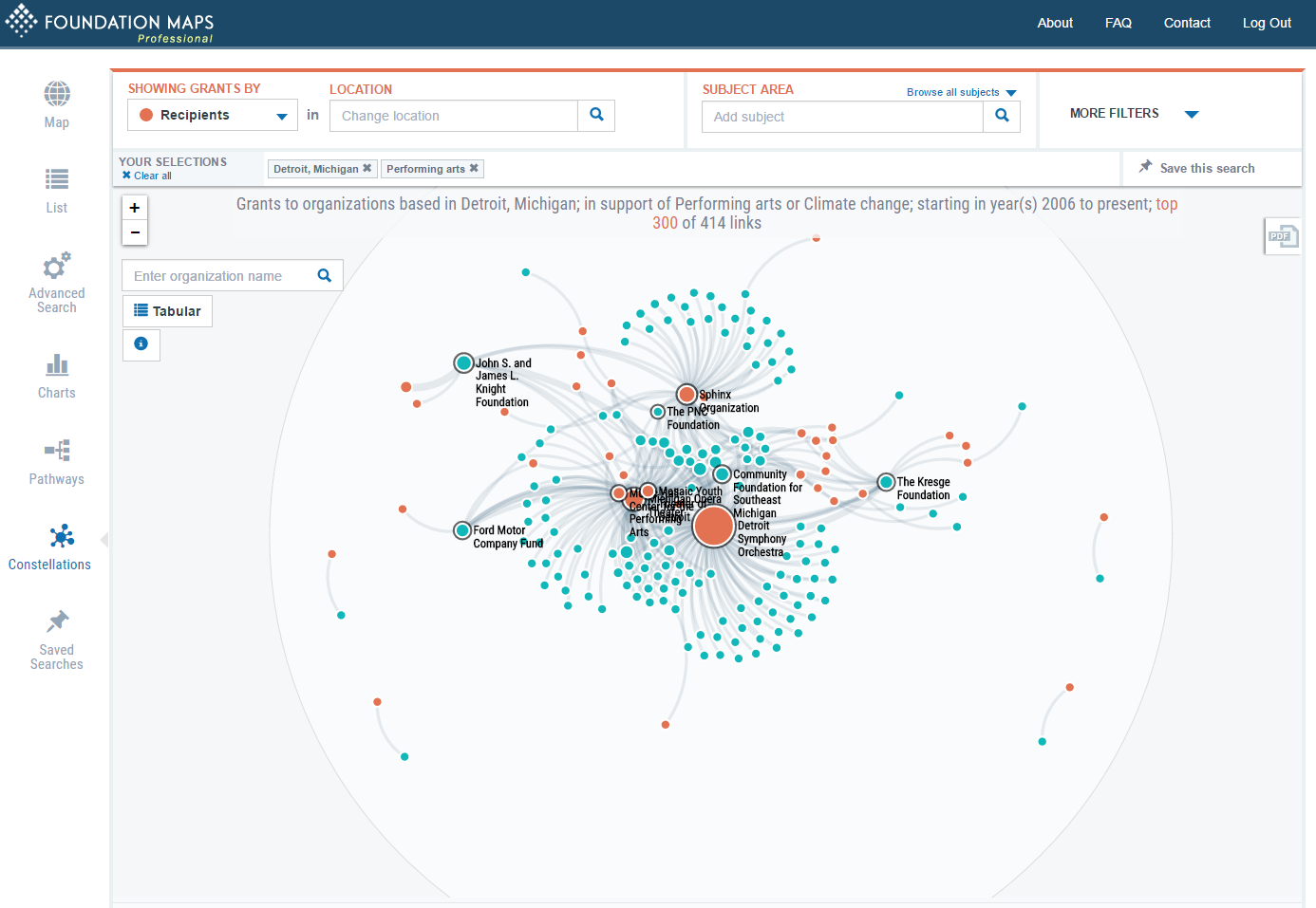
select item1, item2, sum(amount) from table group by item1, item2It's possible to alter parameters to draw more revealing graphs. Just by visualizing them, it's possible to glean interesting information from the data that is hard to get otherwise. Here are some examples from Foundation Maps:
https://raw.githubusercontent.com/gmg444/dgd2016/master/Constellations_ClimateChangeCalifornia.png
https://raw.githubusercontent.com/gmg444/dgd2016/master/Constellations_EducationIndia.png
https://raw.githubusercontent.com/gmg444/dgd2016/master/Constellations_DetroitPerformingArts.png
The next important decision after which are nodes and which are edges, are which tabular attributes are important to represent in the graph. In this example, you can see that the edge amount and node location attributes are important for a visual representation:
In [ ]:


pylab.rcParams['figure.figsize'] = (5.0, 5.0)
with open("state_to_state.txt") as f:
    content = f.readlines()
g = nx.Graph()
for line in content:
    arr = line.encode('ascii', 'ignore').replace("\n", "").split("\t")
    g.add_node(arr[0], { "lat": float(arr[1]), "lon": float(arr[2]) })
    g.add_node(arr[4], { "lat": float(arr[5]), "lon": float(arr[6]) })
    amt = int(arr[3])
    g.add_edge(arr[0], arr[4], { "amount": amt })
#for n in g.nodes():
#    if n is None:
#        g.remove_node(n)
nx.draw(g)
plt.show()
Not very informative.... Specifying the position of the nodes and width of the edges from attribute data makes things much clearer:
In [ ]:


pylab.rcParams['figure.figsize'] = (15.0, 8.0)

# print g.nodes(data=True)

position = {}
for n in g.nodes(data=True):
    if n[0] is None:
        continue
    position[n[0]] = [n[1].get('lon', 0), n[1].get('lat', 0)]

widths = [m[2]["amount"]/100000000 for m in g.edges(data=True)]
nx.draw(g, position, width=widths, with_labels=True)
plt.show()
Static visualizations can be problematic with network data. Dynamic and/or interactive visualizations can be more effective because they allow you to reduce the obscuring effect of multiple overlapping lines (the "hairball" effect). For example, this data represented as a static graph can be difficult to decipher. It contains a the co-occurrence of different grant subjects among a set of grants.
In [ ]:


with open('subject_to_subject.txt','r') as f:
    print f.read()
We can use the csv library to read the file into a dictionary:
In [ ]:


pylab.rcParams['figure.figsize'] = (3.0, 3.0)

import csv

g=nx.Graph()  #  Let's create an undirected graph to hold the
with open('subject_to_subject.txt','r') as f:
    data = f.read()
reader = csv.DictReader(data.splitlines(), delimiter='\t')
for row in reader:
    g.add_edge(row["label1"], row["label2"], { "amount": row["amount"]})
nx.draw(g)
Whereas an interactive visualization of the same data can be easier to make sense of:
http://gis.foundationcenter.org/networkxd3/subject_chords.html
We use JavaScript / D3 for many visualizations. In this case the data was read directly into a javascript data structure for visualization in D3:
d3.tsv("SubjectToSubject.txt", function(subjectToSubject){
    var i;
    var nodes = []
    var edges = []
    for(i=0; i<subjectToSubject.length; i++){
        if (nodes.indexOf(subjectToSubject[i].id1) < 0){
            nodes.push(subjectToSubject[i].id1);
        }
        var e = {};
        e["node1"] = subjectToSubject[i].id1    ;
        e["value"] = subjectToSubject[i].count;
        e["node2"] = subjectToSubject[i].id2;
        edges.push(e);
    }

    m = createMatrix(nodes, edges);
    visualize(m, nodes);
});
However, like many JavaScript visulization tools, D3 works well with data in JSON format. A typical JSON graph format contains two lists of objects - one of nodes, another of links, similar to the gefx format in XML. Fortunately, NetworkX has built-in support for generating JSON data in this format:
In [ ]:


import networkx as nx
from networkx.readwrite import json_graph
json_graph.node_link_data(g, attrs= dict(id='name',  source='source', target='target', key='key'))
Along related lines, a similarity matrix, where every node is connected to every other node by an edge with a distance or similarity measure, is indecipherable if there are too many nodes, as the number of edges is close to the square of the number of nodes:
In [ ]:


pylab.rcParams['figure.figsize'] = (5.0, 5.0)
g = nx.complete_graph(20)
pos=nx.spring_layout(g)
nx.draw(g, pos=pos)
Whereas an interactive matrix can be much easier to understand:
http://gis.foundationcenter.org/networkxd3/foundation_matrix.html
In this notebook we demonstrated some basic ways of getting data into and out of NetworkX graphs. In the next section, we'll look at some different kinds of networks and measures that can be used to describe their structure.
Aric A. Hagberg, Daniel A. Schult and Pieter J. Swart, “Exploring network structure, dynamics, and function using NetworkX”, in Proceedings of the 7th Python in Science Conference (SciPy2008), Gäel Varoquaux, Travis Vaught, and Jarrod Millman (Eds), (Pasadena, CA USA), pp. 11–15, Aug 2008
Bostock, Michael, Vadim Ogievetsky, and Jeffrey Heer. "D³ data-driven documents." Visualization and Computer Graphics, IEEE Transactions on 17.12 (2011): 2301-2309.
Brath, Richard, and David Jonker. Graph Analysis and Visualization: Discovering Business Opportunity in Linked Data. John Wiley & Sons, 2015.