The Gene Expression Omnibus (GEO) is a website funded by the NIH to store the expression data associated with papers. Many papers require you to submit your data to GEO to be able to publish.
Search GEO for the accession ID from Shalek + Satija 2013. Download the "Series Matrix" to your laptop and copy the link for the GSE41265_allGenesTPM.txt.gz" file. All the "Series" file formats contain the same information in different formats. The Matrix one is the easiest to understand.
Open the "Series Matrix" in Excel (or equivalent) on your laptop. And look at the format and what's described.
In [ ]:


! wget [link to GSE41265_allGenesTPM.txt.gz file]
In [ ]:


# Read the data table
shalek2013_expression = pd.read_table('GSE41265_allGenesTPM.txt.gz',

                               # Sets the first (Python starts counting from 0 not 1) column as the row names
                               index_col=0,

                               # Tells pandas to decompress the gzipped file
                               compression='gzip')
Let's look at the top of the dataframe by using head(). By default, this shows the first 5 rows.
In [ ]:


shalek2013_expression.head()
To specify a certain number of rows, put a number between the parentheses.
In [ ]:


shalek2013_expression.head(8)
In [ ]:


# YOUR CODE HERE
In [ ]:


# The Assert statement checks that the last output "_" has the correct row names
assert _.index.tolist() == ['XKR4', 'AB338584', 'B3GAT2', 'NPL', 'T2', 'T', 'PDE10A', '1700010I14RIK',
                            '6530411M01RIK', 'PABPC6', 'AK019626', 'AK020722', 'QK', 'B930003M22RIK',
                            'RGS8', 'PACRG', 'AK038428']
Let's get a sense of this data by plotting the distributions using boxplot from seaborn. To save the output, we'll need to get access to the current figure, and save this to a variable using plt.gcf(). And then we'll save this figure with fig.savefig("filename.pdf"). You can use other extensions (e.g. ".png", ".tiff" and it'll automatically save as that forma)
In [ ]:


sns.boxplot(shalek2013_expression)

# gcf = Get current figure
fig = plt.gcf()
fig.savefig('shalek2013_expression_boxplot.pdf')
Oh right we have expression data and the scales are enormous... notice the 140,000 maximum. Let's add 1 to all values and take the log2 of the data. We add one because log(0) is undefined and then all our logged values start from zero too. This "$\log_2(TPM + 1)$" is a very common transformation of expression data so it's easier to analyze.
In [ ]:


expression_logged = np.log2(shalek2013_expression+1)
expression_logged.head()
In [ ]:


sns.boxplot(expression_logged)

# gcf = Get current figure
fig = plt.gcf()
fig.savefig('expression_logged_boxplot.pdf')
YOUR ANSWER HERE
In [ ]:


expression_logged < 10
What's nice about booleans is that False is 0 and True is 1, so we can sum to get the number of "Trues." This is a simple, clever way that we can filter on a count for the data. We could use this boolean dataframe to filter our original dataframe, but then we lose information. For all values that are less than 10, it puts in a "not a number" - "NaN."
In [ ]:


expression_at_most_10 = expression_logged[expression_logged < 10]
expression_at_most_10
In [ ]:


# YOUR CODE HERE
In [ ]:


# This `assert` tests for the total number of "NaN"s (nulls) in the dataframe by getting a boolean matrix from
# `isnull()` and then summing twice to get the total
assert expression_greater_than_5.isnull().sum().sum() == 539146
The crude filtering above is okay, but we're smarter than that. We want to use the filtering in the paper:
... discarded genes that were not appreciably expressed (transcripts per million (TPM) > 1) in at least three individual cells, retaining 6,313 genes for further analysis.
We want to do THAT, but first we need a couple more concepts. The first one is summing booleans.
Remember that booleans are really 0s (False) and 1s (True)? This turns out to be VERY convenient and we can use this concept in clever ways.
We can use .sum() on a boolean matrix to get the number of genes with expression greater than 10 for each sample:
In [ ]:


(expression_logged > 10).sum()
pandas is column-oriented and by default, it will give you a sum for each column. But we want a sum for each row. How do we do that?
We can sum the boolean matrix we created with "expression_logged < 10" along axis=1 (along the samples) to get for each gene, how many samples have expression less than 10. In pandas, this column is called a "Series" because it has only one dimension - its length. Internally, pandas stores dataframes as a bunch of columns - specifically these Seriesssssss.
This turns out to be not that many.
In [ ]:


(expression_logged > 10).sum(axis=1)
Now we can apply ANOTHER filter and find genes that are "present" (expression greater than 10) in at least 5 samples. We'll save this as the variable genes_of_interest. Notice that this doesn't the genes_of_interest but rather the list at the bottom. This is because what you see under a code cell is the output of the last thing you called. The "hash mark"/"number sign" "#" is called a comment character and makes the rest of the line after it not read by the Python language.
To see genes_of_interest, "uncomment" the line by removing the hash sign, and commenting out the list [1, 2, 3].
In [ ]:


genes_of_interest = (expression_logged > 10).sum(axis=1) >= 5
# genes_of_interest
[1, 2, 3]
In [ ]:


assert isinstance(_, pd.Series)
Now we have some genes that we want to use - how do you pick just those? This can also be called "subsetting" and in pandas has the technical name indexing
In pandas, to get the rows (genes) you want using their name (gene symbol) or boolean matrix, you use .loc[rows_you_want]. Check it out below.
In [ ]:


expression_filtered = expression_logged.loc[genes_of_interest]
print(expression_filtered.shape)  # shows (nrows, ncols) - like in manhattan you do the Street then the Avenue
expression_filtered.head()
Wow, our matrix is very small - 197 genes! We probably don't want to filter THAT much... I'd say a range of 5,000-15,000 genes after filtering is a good ballpark. Not too big so it's impossible to work with but not too small that you can't do any statistics.
We'll get closer to the expression data created by the paper. Remember that they filtered on genes that had expression greater than 1 in at least 3 single cells. We'll filter for expression greater than 1 in at least 3 samples for now - we'll get to the single stuff in a bit. For now, we'll filter on all samples.
Create a dataframe called expression_filtered_by_all_samples that consists only of genes that have expression greater than 1 in at least 3 samples.
IndexingError: Unalignable boolean Series key providedIf you're getting this error, double-check your .sum() command. Did you remember to specify that you want to get the "number present" for each gene (row)? Remember that .sum() by default gives you the sum over columns. How do you get the sum over rows?
In [ ]:


# YOUR CODE HERE
print(expression_filtered_by_all_samples.shape)
expression_filtered_by_all_samples.head()
In [ ]:


assert expression_filtered_by_all_samples.shape == (9943, 21)
Just for fun, let's see how our the distributions in our expression matrix have changed. If you wnat to save the figure
In [ ]:


sns.boxplot(expression_filtered_by_all_samples)

# gcf = Get current figure
fig = plt.gcf()
fig.savefig('expression_filtered_by_all_samples_boxplot.pdf')
In the next exercise, we'll get just the single cells
For the next step, we're going to pull out just the pooled - which are conveniently labeled as "P#". We'll do this using a list comprehension, which means we'll create a new list based on the items in shalek2013_expression.columns and whether or not they start with the letter 'P'.
In [ ]:


pooled_ids = [x for x in expression_logged.columns if x.startswith('P')]
pooled_ids
We'll access the columns we want using this bracket notation (note that this only works for columns, not rows)
In [ ]:


pooled = expression_logged[pooled_ids]
pooled.head()
We could do the same thing using .loc but we would need to put a colon ":" in the "rows" section (first place) to show that we want "all rows."
In [ ]:


expression_logged.loc[:, pooled_ids].head()
In [ ]:
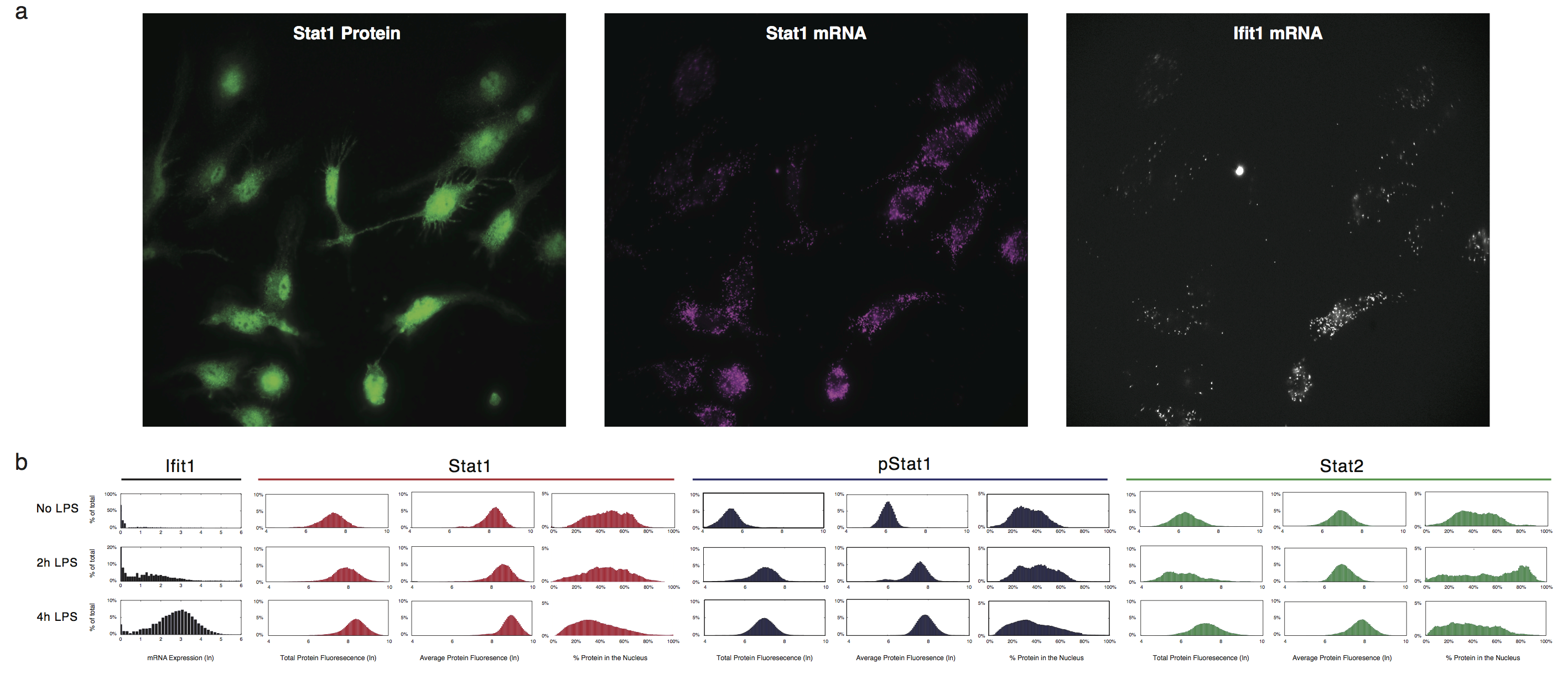
# YOUR CODE HERE
print(singles.shape)
singles.head()
In [ ]:


assert singles.shape == (27723, 18)
Now we'll actually do the filtering done by the paper. Using the singles dataframe you just created, get the genes that have expression greater than 1 in at least 3 single cells, and use that to filter expression_logged. Call this dataframe expression_filtered_by_singles.
In [ ]:


# YOUR CODE HERE
print(expression_filtered_by_singles.shape)
expression_filtered_by_singles.head()
In [ ]:


assert expression_filtered_by_singles.shape == (6312, 21)
Let's make a boxplot again to see how the data has changed.
In [ ]:


sns.boxplot(expression_filtered_by_singles)

fig = plt.gcf()
fig.savefig('expression_filtered_by_singles_boxplot.pdf')
This is much nicer because now we don't have so many zeros and each sample has a reasonable dynamic range.
You may be wondering, we did all this work to remove some zeros..... so the FPKM what? Let's take a look at how this affects the relationships between samples using sns.jointplot from seaborn, which will plot a correlation scatterplot. This also calculates the Pearson correlation, a linear correlation metric.
Let's first do this on the unlogged data.
In [ ]:


sns.jointplot('S1', 'S2', shalek2013_expression)
Pretty funky looking huh? That's why we logged it :)
Now let's try this on the logged data.
In [ ]:


sns.jointplot(expression_logged['S1'], expression_logged['S2'])
Hmm our pearson correlation increased from 0.62 to 0.64. Why could that be?
Let's look at this same plot using the filtered data.
In [ ]:


sns.jointplot('S1', 'S2', expression_filtered_by_singles)
In [ ]:


# YOUR CODE HERE
In the interest of reproducibility, and to showcase our new package flotilla, I've reproduced many figures from the landmark single-cell paper, Single-cell transcriptomics reveals bimodality in expression and splicing in immune cells by Shalek and Satija, et al. Nature (2013).
Before we begin, let's import everything we need.
In [4]:


# Turn on inline plots with IPython
%matplotlib inline

# Import the flotilla package for biological data analysis
import flotilla

# Import "numerical python" library for number crunching
import numpy as np

# Import "panel data analysis" library for tabular data
import pandas as pd

# Import statistical data visualization package
# Note: As of November 6th, 2014, you will need the "master" version of
# seaborn on github (v0.5.dev), installed via
# "pip install git+ssh://git@github.com/mwaskom/seaborn.git
import seaborn as sns
In the 2013 paper, Single-cell transcriptomics reveals bimodality in expression and splicing in immune cells (Shalek and Satija, et al. Nature (2013)), Regev and colleagues performed single-cell sequencing 18 bone marrow-derived dendritic cells (BMDCs), in addition to 3 pooled samples.
First, we will read in the expression data. These data were obtained using,
In [2]:


%%bash
wget ftp://ftp.ncbi.nlm.nih.gov/geo/series/GSE41nnn/GSE41265/suppl/GSE41265_allGenesTPM.txt.gz
We will also compare to the supplementary table 2 data, obtained using
In [ ]:


%%bash
wget http://www.nature.com/nature/journal/v498/n7453/extref/nature12172-s1.zip
unzip nature12172-s1.zip
In [5]:


expression = pd.read_table("GSE41265_allGenesTPM.txt.gz", compression="gzip", index_col=0)
expression.head()
Out[5]:
These data are in the "transcripts per million," aka TPM unit. See this blog post if that sounds weird to you.
These data are formatted with samples on the columns, and genes on the rows. But we want the opposite, with samples on the rows and genes on the columns. This follows scikit-learn's standard of data matrices with size (n_samples, n_features) as each gene is a feature. So we will simply transpose this.
In [6]:


expression = expression.T
expression.head()
Out[6]:
The authors filtered the expression data based on having at least 3 single cells express genes with at TPM (transcripts per million, ) > 1. We can express this in using the pandas DataFrames easily.
First, from reading the paper and looking at the data, I know there are 18 single cells, and there are 18 samples that start with the letter "S." So I will extract the single samples from the index (row names) using a lambda, a tiny function which in this case, tells me whether or not that sample id begins with the letter "S".
In [7]:


singles_ids = expression.index[expression.index.map(lambda x: x.startswith('S'))]
print('number of single cells:', len(singles_ids))
singles = expression.ix[singles_ids]

expression_filtered = expression.ix[:, singles[singles > 1].count() >= 3]
expression_filtered = np.log(expression_filtered + 1)
expression_filtered.shape
Out[7]:
Hmm, that's strange. The paper states that they had 6313 genes after filtering, but I get 6312. Even using "singles >= 1" doesn't help.
(I also tried this with the expression table provided in the supplementary data as "SupplementaryTable2.xlsx," and got the same results.)
Now that we've taken care of importing and filtering the expression data, let's do the feature data of the expression data.
We're going to use their Nature journal-uploaded expression matrix to get the gene lables on whether the gene is a "LPS Response" gene or not.
"Expression feature data" is similar to the fData from BioconductoR, where there's some additional data on your features that you want to look at. They uploaded information about the features in their OTHER expression matrix, uploaded as a supplementary file, Supplementary_Table2.xlsx.
Notice that this is a csv and not the raw xlsx from the journal. This is because Excel mangled the gene IDS that started with 201* and assumed they were dates :(
The workaround I did was to add another column to the sheet with the formula ="'" & A1, press Command-Shift-End to select the end of the rows, and then do Ctrl-D to "fill down" to the bottom (thanks to this stackoverflow post for teaching me how to Excel). Then, I saved the file as a csv for maximum portability and compatibility.
So sorry, this requires some non-programming editing! But I've posted the csv to our github repo with all the data, and we'll access it from there.
In [8]:


expression2 = pd.read_csv('https://raw.githubusercontent.com/YeoLab/shalek2013/master/Supplementary_Table2.csv',
                            # Need to specify the index column as both the first and the last columns,
                            # Because the last column is the "Gene Category"
                            index_col=[0, -1], parse_dates=False, infer_datetime_format=False)

# This was also in features x samples format, so we need to transpose
expression2 = expression2.T
expression2.head()
Out[8]:
Now we need to strip the single-quote I added to all the gene names:
In [9]:


new_index, indexer = expression2.columns.reindex(map(lambda x: (x[0].lstrip("'"), x[1]), expression2.columns.values))
expression2.columns = new_index
expression2.head()
Out[9]:
We want to create a pandas.DataFrame from the "Gene Category" row for our expression_feature_data, which we will do via:
In [10]:


gene_ids, gene_category = zip(*expression2.columns.values)
gene_categories = pd.Series(gene_category, index=gene_ids, name='gene_category')
gene_categories
Out[10]:
In [11]:


expression_feature_data = pd.DataFrame(gene_categories)
expression_feature_data.head()
Out[11]:
We obtain the splicing data from this study from the supplementary information, specifically the Supplementary_Table4.xls
In [12]:


splicing = pd.read_excel('nature12172-s1/Supplementary_Table4.xls', 'splicingTable.txt', index_col=(0,1))
splicing.head()
Out[12]:
In [13]:


splicing = splicing.T
splicing
Out[13]:
The three pooled samples aren't named consistently with the expression data, so we have to fix that.
In [14]:


splicing.index[splicing.index.map(lambda x: 'P' in x)]
Out[14]:
Since the pooled sample IDs are inconsistent with the expression data, we have to change them. We can get the "P" and the number after that using regular expressions, called re in the Python standard library, e.g.:
In [15]:


import re
re.search(r'P\d', '10,000 cell Rep1 (P1)').group()
Out[15]:
In [16]:


def long_pooled_name_to_short(x):
    if 'P' not in x:
        return x
    else:
        return re.search(r'P\d', x).group()


splicing.index.map(long_pooled_name_to_short)
Out[16]:
And now we assign this new index as our index to the splicing dataframe
In [17]:


splicing.index = splicing.index.map(long_pooled_name_to_short)
splicing.head()
Out[17]:
Currently, flotilla only supports non-multi-index Dataframes. This means that we need to change the columns of splicing to just the unique event name. We'll save this data as splicing_feature_data, which will rename the crazy feature id to the reasonable gene name.
First, let's extract the event names and gene names from splicing.
In [21]:


event_names, gene_names = zip(*splicing.columns.tolist())
In [23]:


event_names[:10]
Out[23]:
In [25]:


gene_names[:10]
Out[25]:
Now we can rename the columns of splicing easily
In [26]:


splicing.columns = event_names
splicing.head()
Out[26]:
Now let's create splicing_feature_data to map these event names to the gene names, and to the gene_category from before.
In [27]:


splicing_feature_data = pd.DataFrame(index=event_names)
splicing_feature_data['gene_name'] = gene_names
splicing_feature_data.head()
Out[27]:
One thing we need to keep in mind is that the gene names in the expression data were uppercase. We can convert our gene names to uppercase with,`
In [29]:


splicing_feature_data['gene_name'] = splicing_feature_data['gene_name'].str.upper()
splicing_feature_data.head()
Out[29]:
Now let's get the gene_category of these genes by doing a join on the splicing data and the expression data.
In [30]:


splicing_feature_data = splicing_feature_data.join(expression_feature_data, on='gene_name')
splicing_feature_data.head()
Out[30]:
Now we have the gene_category encoded in the splicing data as well!
Now let's get into creating a metadata dataframe. We'll use the index from the expression_filtered data to create the minimum required column, 'phenotype', which has the name of the phenotype of that cell. And we'll also add the column 'pooled' to indicate whether this sample is pooled or not.
In [31]:


metadata = pd.DataFrame(index=expression_filtered.index)
metadata['phenotype'] = 'BDMC'
metadata['pooled'] = metadata.index.map(lambda x: x.startswith('P'))

metadata
Out[31]:
In [32]:


mapping_stats = pd.read_excel('nature12172-s1/Supplementary_Table1.xls', sheetname='SuppTable1 2.txt')
mapping_stats
Out[32]:
Now we can start creating figures!
Here, we will attempt to re-create the sub-panels in Figure 1, where the original is:
In [39]:


import seaborn as sns
sns.set_style('ticks')

x = expression_filtered.ix['P1']
y = expression_filtered.ix['P2']
jointgrid = sns.jointplot(x, y, joint_kws=dict(alpha=0.5))
xmin, xmax, ymin, ymax = jointgrid.ax_joint.axis()
jointgrid.ax_joint.set_xlim(0, xmax)
jointgrid.ax_joint.set_ylim(0, ymax);
In [41]:


import seaborn as sns
sns.set_style('ticks')

x = expression_filtered.ix['S1']
y = expression_filtered.ix['S2']
jointgrid = sns.jointplot(x, y, joint_kws=dict(alpha=0.5))

# Adjust xmin, ymin to 0
xmin, xmax, ymin, ymax = jointgrid.ax_joint.axis()
jointgrid.ax_joint.set_xlim(0, xmax)
jointgrid.ax_joint.set_ylim(0, ymax);
By the way, you can do other kinds of plots with flotilla, like a kernel density estimate ("kde") plot:
In [42]:


study.plot_two_samples('S1', 'S2', kind='kde')
Or a binned hexagon plot ("hexbin"):
In [43]:


study.plot_two_samples('S1', 'S2', kind='hexbin')
Any inputs that are valid to seaborn's jointplot are valid.
In [44]:


x = study.expression.data.ix['P1']
y = study.expression.singles.mean()
y.name = "Average singles"

jointgrid = sns.jointplot(x, y, joint_kws=dict(alpha=0.5))

# Adjust xmin, ymin to 0
xmin, xmax, ymin, ymax = jointgrid.ax_joint.axis()
jointgrid.ax_joint.set_xlim(0, xmax)
jointgrid.ax_joint.set_ylim(0, ymax);
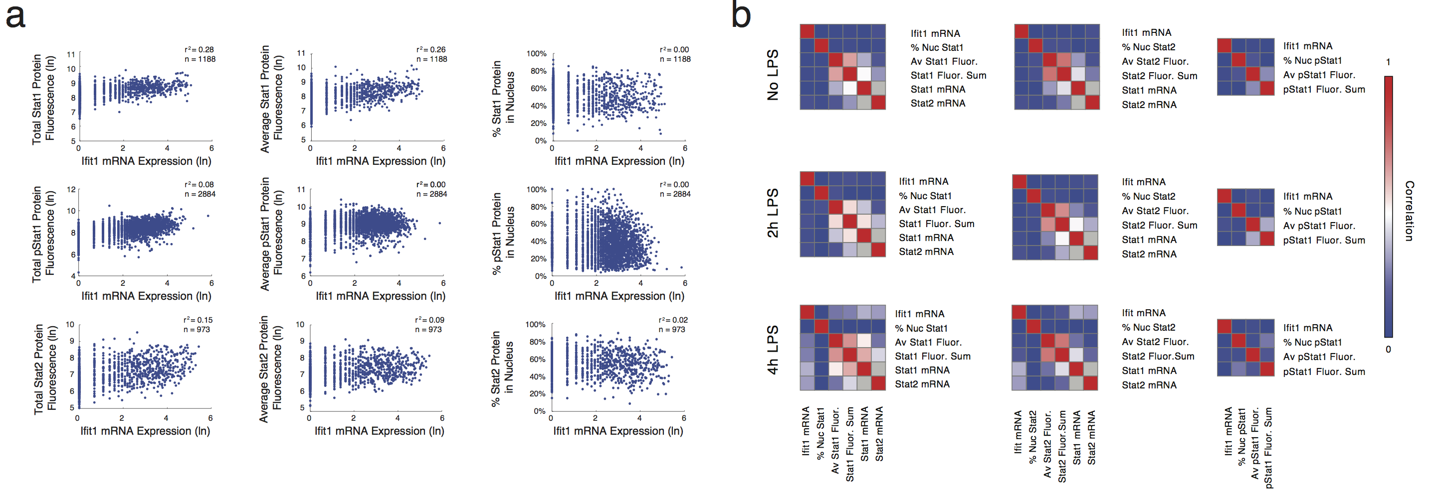
Next, we will attempt to recreate the figures from Figure 2:
For this figure, we will need the "LPS Response" and "Housekeeping" gene annotations, from the expression_feature_data that we created.
In [45]:


# Get colors for plotting the gene categories
dark2 = sns.color_palette('Dark2')

singles = study.expression.singles
# Get only gene categories for genes in the singles data
singles, gene_categories = singles.align(study.expression.feature_data.gene_category, join='left', axis=1)

mean = singles.mean()
std = singles.std()

jointgrid = sns.jointplot(mean, std, color='#262626', joint_kws=dict(alpha=0.5))

for i, (category, s) in enumerate(gene_categories.groupby(gene_categories)):
    jointgrid.ax_joint.plot(mean[s.index], std[s.index], 'o', color=dark2[i], markersize=5)

jointgrid.ax_joint.set_xlabel('Standard deviation in single cells $\mu$')
jointgrid.ax_joint.set_ylabel('Average expression in single cells $\sigma$')

xmin, xmax, ymin, ymax = jointgrid.ax_joint.axis()
vmax = max(xmax, ymax)
vmin = min(xmin, ymin)
jointgrid.ax_joint.plot([0, vmax], [0, vmax], color='steelblue')
jointgrid.ax_joint.plot([0, vmax], [0, .25*vmax], color='grey')
jointgrid.ax_joint.set_xlim(0, xmax)
jointgrid.ax_joint.set_ylim(0, ymax)

jointgrid.ax_joint.fill_betweenx((ymin, ymax), 0, np.log(250), alpha=0.5, zorder=-1);
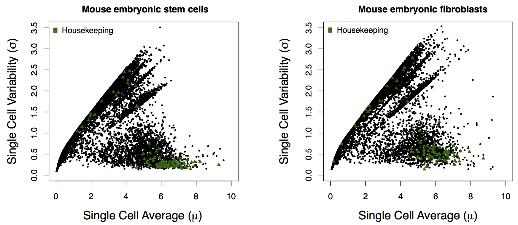
I couldn't find the data for the hESCs for the right-side panel of Fig. 2a, so I couldn't remake the figure.
In the paper, they use "522 most highly expressed genes (single-cell average TPM > 250)", but I wasn't able to replicate their numbers. If I use the pre-filtered expression data that I fed into flotilla, then I get 297 genes:
In [32]:


mean = study.expression.singles.mean()
highly_expressed_genes = mean.index[mean > np.log(250 + 1)]
len(highly_expressed_genes)
Out[32]:
Which is much less. If I use the original, unfiltered data, then I get the "522" number, but this seems strange because they did the filtering step of "discarded genes not appreciably expressed (transcripts per million (TPM) > 1) in at least three individual cells, retaining 6,313 genes for further analysis", and yet they went back to the original data to get this new subset.
In [33]:


expression.ix[:, expression.ix[singles_ids].mean() > 250].shape
Out[33]:
In [34]:


expression_highly_expressed = np.log(expression.ix[singles_ids, expression.ix[singles_ids].mean() > 250] + 1)

mean = expression_highly_expressed.mean()

std = expression_highly_expressed.std()

mean_bins = pd.cut(mean, bins=np.arange(0, 11, 1))

# Coefficient of variation
cv = std/mean
cv.sort()

genes = mean.index


# for name, df in shalek2013.expression.singles.groupby(dict(zip(genes, mean_bins)), axis=1):
def calculate_cells_per_tpm_per_cv(df, cv):
    df = df[df > 1]
    df_aligned, cv_aligned = df.align(cv, join='inner', axis=1)
    cv_aligned.sort()
    n_cells = pd.Series(0, index=cv.index)
    n_cells[cv_aligned.index] = df_aligned.ix[:, cv_aligned.index].count()
    return n_cells

grouped = expression_highly_expressed.groupby(dict(zip(genes, mean_bins)), axis=1)
cells_per_tpm_per_cv = grouped.apply(calculate_cells_per_tpm_per_cv, cv=cv)
Here's how you would make the original figure from the paper:
In [35]:


import matplotlib.pyplot as plt

fig, ax = plt.subplots(figsize=(10, 10))
sns.heatmap(cells_per_tpm_per_cv, linewidth=0, ax=ax, yticklabels=False)
ax.set_yticks([])
ax.set_xlabel('ln(TPM, binned)');
Doesn't quite look the same. Maybe the y-axis labels were opposite, and higher up on the y-axis was less variant? Because I see a blob of color for (1,2] TPM (by the way, the figure in the paper is not TPM+1 as previous figures were)
This is how you would make a modified version of the figure, which also plots the coefficient of variation on a side-plot, which I like because it shows the CV changes directly on the heatmap. Also, technically this is $\ln$(TPM+1).
In [36]:


from matplotlib import gridspec

fig = plt.figure(figsize=(12, 10))

gs = gridspec.GridSpec(1, 2, wspace=0.01, hspace=0.01, width_ratios=[.2, 1])
cv_ax = fig.add_subplot(gs[0, 0])
heatmap_ax = fig.add_subplot(gs[0, 1])

sns.heatmap(cells_per_tpm_per_cv, linewidth=0, ax=heatmap_ax)
heatmap_ax.set_yticks([])
heatmap_ax.set_xlabel('$\ln$(TPM+1), binned')

y = np.arange(cv.shape[0])
cv_ax.set_xscale('log')
cv_ax.plot(cv, y, color='#262626')
cv_ax.fill_betweenx(cv, np.zeros(cv.shape), y, color='#262626', alpha=0.5)
cv_ax.set_ylim(0, y.max())
cv_ax.set_xlabel('CV = $\mu/\sigma$')
cv_ax.set_yticks([])
sns.despine(ax=cv_ax, left=True, right=False)
We will attempt to re-create the sub-panel figures from Figure 3:
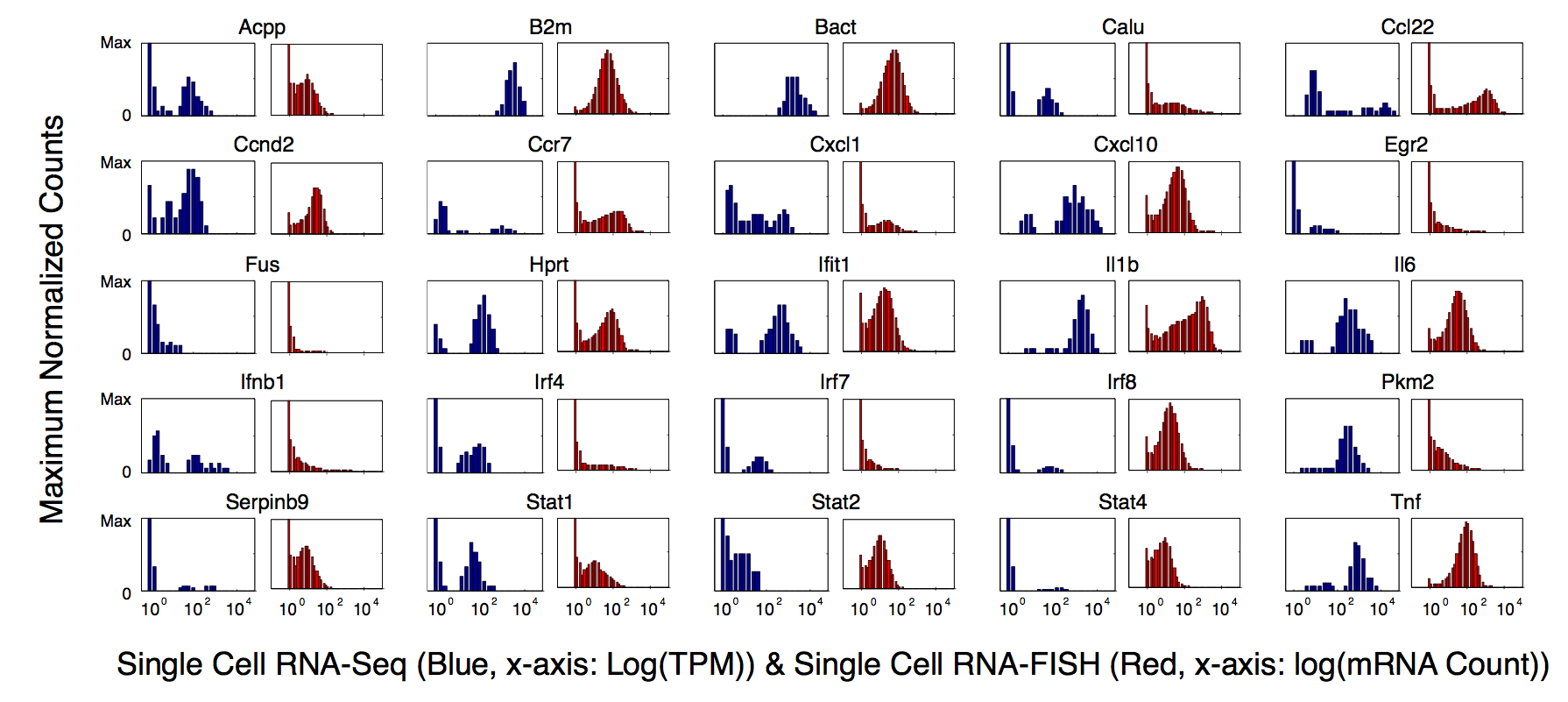
Since we can't re-do the microscopy (Figure 3a) or the RNA-FISH counts (Figure 3c), we will make Figures 3b. These histograms are simple to do outside of flotilla, so we do not have them within flotilla.
In [37]:


fig, ax = plt.subplots()
sns.distplot(study.splicing.singles.values.flat, bins=np.arange(0, 1.05, 0.05), ax=ax)
ax.set_xlim(0, 1)
sns.despine()
In [38]:


fig, ax = plt.subplots()
sns.distplot(study.splicing.pooled.values.flat, bins=np.arange(0, 1.05, 0.05), ax=ax, color='grey')
ax.set_xlim(0, 1)
sns.despine()
We will attempt to re-create the sub-panel figures from Figure 4:
Here, we can use the "interactive_pca" function we have to explore different dimensionality reductions on the data.
Equivalently, I could have written out the plotting command by hand, instead of using study.interactive_pca:
In [40]:


study.plot_pca(feature_subset='gene_category: LPS Response', sample_subset='not (pooled)', plot_violins=False, show_point_labels=True)
Out[40]:
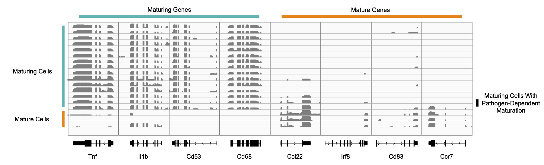
As in the paper, the cells S12, S13, and S16 appear in a cluster that is separate from the remaining cells. From the paper, these were the "matured" bone-marrow derived dendritic cells, after stimulation with a lipopolysaccharide. We can mark these as mature in our metadata,
In [48]:


mature = ['S12', 'S13', 'S16']
study.metadata.data['maturity'] = metadata.index.map(lambda x: 'mature' if x in mature else 'immature')
study.metadata.data.head()
Out[48]:
Then, we can set maturity as the column we use for coloring the PCA, since before it was the "phenotype" column.
In [49]:


study.metadata.phenotype_col = 'maturity'
study.save('shalek2013')
study = flotilla.embark('shalek2013')
In [50]:


study.plot_pca(feature_subset='gene_category: LPS Response', sample_subset='not (pooled)', plot_violins=False, show_point_labels=True)
Out[50]:
In [51]:


study.save('shalek2013')
Without flotilla, plot_pca is quite a bit of code:
In [41]:
import sys
from collections import defaultdict
from itertools import cycle
import math
from sklearn import decomposition
from sklearn.preprocessing import StandardScaler
import pandas as pd
from matplotlib.gridspec import GridSpec, GridSpecFromSubplotSpec
import matplotlib.pyplot as plt
import numpy as np
import pandas as pd
import seaborn as sns
from flotilla.visualize.color import dark2
from flotilla.visualize.generic import violinplot
class DataFrameReducerBase(object):
"""
Just like scikit-learn's reducers, but with prettied up DataFrames.
"""
def __init__(self, df, n_components=None, **decomposer_kwargs):
# This magically initializes the reducer like DataFramePCA or DataFrameNMF
if df.shape[1] <= 3:
raise ValueError(
"Too few features (n={}) to reduce".format(df.shape[1]))
super(DataFrameReducerBase, self).__init__(n_components=n_components,
**decomposer_kwargs)
self.reduced_space = self.fit_transform(df)
def relabel_pcs(self, x):
return "pc_" + str(int(x) + 1)
def fit(self, X):
try:
assert type(X) == pd.DataFrame
except AssertionError:
sys.stdout.write("Try again as a pandas DataFrame")
raise ValueError('Input X was not a pandas DataFrame, '
'was of type {} instead'.format(str(type(X))))
self.X = X
super(DataFrameReducerBase, self).fit(X)
self.components_ = pd.DataFrame(self.components_,
columns=self.X.columns).rename_axis(
self.relabel_pcs, 0)
try:
self.explained_variance_ = pd.Series(
self.explained_variance_).rename_axis(self.relabel_pcs, 0)
self.explained_variance_ratio_ = pd.Series(
self.explained_variance_ratio_).rename_axis(self.relabel_pcs,
0)
except AttributeError:
pass
return self
def transform(self, X):
component_space = super(DataFrameReducerBase, self).transform(X)
if type(self.X) == pd.DataFrame:
component_space = pd.DataFrame(component_space,
index=X.index).rename_axis(
self.relabel_pcs, 1)
return component_space
def fit_transform(self, X):
try:
assert type(X) == pd.DataFrame
except:
sys.stdout.write("Try again as a pandas DataFrame")
raise ValueError('Input X was not a pandas DataFrame, '
'was of type {} instead'.format(str(type(X))))
self.fit(X)
return self.transform(X)
class DataFramePCA(DataFrameReducerBase, decomposition.PCA):
pass
class DataFrameNMF(DataFrameReducerBase, decomposition.NMF):
def fit(self, X):
"""
duplicated fit code for DataFrameNMF because sklearn's NMF cheats for
efficiency and calls fit_transform. MRO resolves the closest
(in this package)
_single_fit_transform first and so there's a recursion error:
def fit(self, X, y=None, **params):
self._single_fit_transform(X, **params)
return self
"""
try:
assert type(X) == pd.DataFrame
except:
sys.stdout.write("Try again as a pandas DataFrame")
raise ValueError('Input X was not a pandas DataFrame, '
'was of type {} instead'.format(str(type(X))))
self.X = X
# notice this is fit_transform, not fit
super(decomposition.NMF, self).fit_transform(X)
self.components_ = pd.DataFrame(self.components_,
columns=self.X.columns).rename_axis(
self.relabel_pcs, 0)
return self
class DataFrameICA(DataFrameReducerBase, decomposition.FastICA):
pass
class DecompositionViz(object):
"""
Plots the reduced space from a decomposed dataset. Does not perform any
reductions of its own
"""
def __init__(self, reduced_space, components_,
explained_variance_ratio_,
feature_renamer=None, groupby=None,
singles=None, pooled=None, outliers=None,
featurewise=False,
order=None, violinplot_kws=None,
data_type='expression', label_to_color=None,
label_to_marker=None,
scale_by_variance=True, x_pc='pc_1',
y_pc='pc_2', n_vectors=20, distance='L1',
n_top_pc_features=50, max_char_width=30):
"""Plot the results of a decomposition visualization
Parameters
----------
reduced_space : pandas.DataFrame
A (n_samples, n_dimensions) DataFrame of the post-dimensionality
reduction data
components_ : pandas.DataFrame
A (n_features, n_dimensions) DataFrame of how much each feature
contributes to the components (trailing underscore to be
consistent with scikit-learn)
explained_variance_ratio_ : pandas.Series
A (n_dimensions,) Series of how much variance each component
explains. (trailing underscore to be consistent with scikit-learn)
feature_renamer : function, optional
A function which takes the name of the feature and renames it,
e.g. from an ENSEMBL ID to a HUGO known gene symbol. If not
provided, the original name is used.
groupby : mapping function | dict, optional
A mapping of the samples to a label, e.g. sample IDs to
phenotype, for the violinplots. If None, all samples are treated
the same and are colored the same.
singles : pandas.DataFrame, optional
For violinplots only. If provided and 'plot_violins' is True,
will plot the raw (not reduced) measurement values as violin plots.
pooled : pandas.DataFrame, optional
For violinplots only. If provided, pooled samples are plotted as
black dots within their label.
outliers : pandas.DataFrame, optional
For violinplots only. If provided, outlier samples are plotted as
a grey shadow within their label.
featurewise : bool, optional
If True, then the "samples" are features, e.g. genes instead of
samples, and the "features" are the samples, e.g. the cells
instead of the gene ids. Essentially, the transpose of the
original matrix. If True, then violins aren't plotted. (default
False)
order : list-like
The order of the labels for the violinplots, e.g. if the data is
from a differentiation timecourse, then this would be the labels
of the phenotypes, in the differentiation order.
violinplot_kws : dict
Any additional parameters to violinplot
data_type : 'expression' | 'splicing', optional
For violinplots only. The kind of data that was originally used
for the reduction. (default 'expression')
label_to_color : dict, optional
A mapping of the label, e.g. the phenotype, to the desired
plotting color (default None, auto-assigned with the groupby)
label_to_marker : dict, optional
A mapping of the label, e.g. the phenotype, to the desired
plotting symbol (default None, auto-assigned with the groupby)
scale_by_variance : bool, optional
If True, scale the x- and y-axes by their explained_variance_ratio_
(default True)
{x,y}_pc : str, optional
Principal component to plot on the x- and y-axis. (default "pc_1"
and "pc_2")
n_vectors : int, optional
Number of vectors to plot of the principal components. (default 20)
distance : 'L1' | 'L2', optional
The distance metric to use to plot the vector lengths. L1 is
"Cityblock", i.e. the sum of the x and y coordinates, and L2 is
the traditional Euclidean distance. (default "L1")
n_top_pc_features : int, optional
THe number of top features from the principal components to plot.
(default 50)
max_char_width : int, optional
Maximum character width of a feature name. Useful for crazy long
feature IDs like MISO IDs
"""
self.reduced_space = reduced_space
self.components_ = components_
self.explained_variance_ratio_ = explained_variance_ratio_
self.singles = singles
self.pooled = pooled
self.outliers = outliers
self.groupby = groupby
self.order = order
self.violinplot_kws = violinplot_kws if violinplot_kws is not None \
else {}
self.data_type = data_type
self.label_to_color = label_to_color
self.label_to_marker = label_to_marker
self.n_vectors = n_vectors
self.x_pc = x_pc
self.y_pc = y_pc
self.pcs = (self.x_pc, self.y_pc)
self.distance = distance
self.n_top_pc_features = n_top_pc_features
self.featurewise = featurewise
self.feature_renamer = feature_renamer
self.max_char_width = max_char_width
if self.label_to_color is None:
colors = cycle(dark2)
def color_factory():
return colors.next()
self.label_to_color = defaultdict(color_factory)
if self.label_to_marker is None:
markers = cycle(['o', '^', 's', 'v', '*', 'D', 'h'])
def marker_factory():
return markers.next()
self.label_to_marker = defaultdict(marker_factory)
if self.groupby is None:
self.groupby = dict.fromkeys(self.reduced_space.index, 'all')
self.grouped = self.reduced_space.groupby(self.groupby, axis=0)
if order is not None:
self.color_ordered = [self.label_to_color[x] for x in self.order]
else:
self.color_ordered = [self.label_to_color[x] for x in
self.grouped.groups]
self.loadings = self.components_.ix[[self.x_pc, self.y_pc]]
# Get the explained variance
if explained_variance_ratio_ is not None:
self.vars = explained_variance_ratio_[[self.x_pc, self.y_pc]]
else:
self.vars = pd.Series([1., 1.], index=[self.x_pc, self.y_pc])
if scale_by_variance:
self.loadings = self.loadings.multiply(self.vars, axis=0)
# sort features by magnitude/contribution to transformation
reduced_space = self.reduced_space[[self.x_pc, self.y_pc]]
farthest_sample = reduced_space.apply(np.linalg.norm, axis=0).max()
whole_space = self.loadings.apply(np.linalg.norm).max()
scale = .25 * farthest_sample / whole_space
self.loadings *= scale
ord = 2 if self.distance == 'L2' else 1
self.magnitudes = self.loadings.apply(np.linalg.norm, ord=ord)
self.magnitudes.sort(ascending=False)
self.top_features = set([])
self.pc_loadings_labels = {}
self.pc_loadings = {}
for pc in self.pcs:
x = self.components_.ix[pc].copy()
x.sort(ascending=True)
half_features = int(self.n_top_pc_features / 2)
if len(x) > self.n_top_pc_features:
a = x[:half_features]
b = x[-half_features:]
labels = np.r_[a.index, b.index]
self.pc_loadings[pc] = np.r_[a, b]
else:
labels = x.index
self.pc_loadings[pc] = x
self.pc_loadings_labels[pc] = labels
self.top_features.update(labels)
def __call__(self, ax=None, title='', plot_violins=True,
show_point_labels=False,
show_vectors=True,
show_vector_labels=True,
markersize=10, legend=True):
gs_x = 14
gs_y = 12
if ax is None:
self.reduced_fig, ax = plt.subplots(1, 1, figsize=(20, 10))
gs = GridSpec(gs_x, gs_y)
else:
gs = GridSpecFromSubplotSpec(gs_x, gs_y, ax.get_subplotspec())
self.reduced_fig = plt.gcf()
ax_components = plt.subplot(gs[:, :5])
ax_loading1 = plt.subplot(gs[:, 6:8])
ax_loading2 = plt.subplot(gs[:, 10:14])
self.plot_samples(show_point_labels=show_point_labels,
title=title, show_vectors=show_vectors,
show_vector_labels=show_vector_labels,
markersize=markersize, legend=legend,
ax=ax_components)
self.plot_loadings(pc=self.x_pc, ax=ax_loading1)
self.plot_loadings(pc=self.y_pc, ax=ax_loading2)
sns.despine()
self.reduced_fig.tight_layout()
if plot_violins and not self.featurewise and self.singles is not None:
self.plot_violins()
return self
def shorten(self, x):
if len(x) > self.max_char_width:
return '{}...'.format(x[:self.max_char_width])
else:
return x
def plot_samples(self, show_point_labels=True,
title='DataFramePCA', show_vectors=True,
show_vector_labels=True, markersize=10,
three_d=False, legend=True, ax=None):
"""
Given a pandas dataframe, performs DataFramePCA and plots the results in a
convenient single function.
Parameters
----------
groupby : groupby
How to group the samples by color/label
label_to_color : dict
Group labels to a matplotlib color E.g. if you've already chosen
specific colors to indicate a particular group. Otherwise will
auto-assign colors
label_to_marker : dict
Group labels to matplotlib marker
title : str
title of the plot
show_vectors : bool
Whether or not to draw the vectors indicating the supporting
principal components
show_vector_labels : bool
whether or not to draw the names of the vectors
show_point_labels : bool
Whether or not to label the scatter points
markersize : int
size of the scatter markers on the plot
text_group : list of str
Group names that you want labeled with text
three_d : bool
if you want hte plot in 3d (need to set up the axes beforehand)
Returns
-------
For each vector in data:
x, y, marker, distance
"""
if ax is None:
ax = plt.gca()
# Plot the samples
for name, df in self.grouped:
color = self.label_to_color[name]
marker = self.label_to_marker[name]
x = df[self.x_pc]
y = df[self.y_pc]
ax.plot(x, y, color=color, marker=marker, linestyle='None',
label=name, markersize=markersize, alpha=0.75,
markeredgewidth=.1)
try:
if not self.pooled.empty:
pooled_ids = x.index.intersection(self.pooled.index)
pooled_x, pooled_y = x[pooled_ids], y[pooled_ids]
ax.plot(pooled_x, pooled_y, 'o', color=color, marker=marker,
markeredgecolor='k', markeredgewidth=2,
label='{} pooled'.format(name),
markersize=markersize, alpha=0.75)
except AttributeError:
pass
try:
if not self.outliers.empty:
outlier_ids = x.index.intersection(self.outliers.index)
outlier_x, outlier_y = x[outlier_ids], y[outlier_ids]
ax.plot(outlier_x, outlier_y, 'o', color=color,
marker=marker,
markeredgecolor='lightgrey', markeredgewidth=5,
label='{} outlier'.format(name),
markersize=markersize, alpha=0.75)
except AttributeError:
pass
if show_point_labels:
for args in zip(x, y, df.index):
ax.text(*args)
# Plot vectors, if asked
if show_vectors:
for vector_label in self.magnitudes[:self.n_vectors].index:
x, y = self.loadings[vector_label]
ax.plot([0, x], [0, y], color='k', linewidth=1)
if show_vector_labels:
x_offset = math.copysign(5, x)
y_offset = math.copysign(5, y)
horizontalalignment = 'left' if x > 0 else 'right'
if self.feature_renamer is not None:
renamed = self.feature_renamer(vector_label)
else:
renamed = vector_label
ax.annotate(renamed, (x, y),
textcoords='offset points',
xytext=(x_offset, y_offset),
horizontalalignment=horizontalalignment)
# Label x and y axes
ax.set_xlabel(
'Principal Component {} (Explains {:.2f}% Of Variance)'.format(
str(self.x_pc), 100 * self.vars[self.x_pc]))
ax.set_ylabel(
'Principal Component {} (Explains {:.2f}% Of Variance)'.format(
str(self.y_pc), 100 * self.vars[self.y_pc]))
ax.set_title(title)
if legend:
ax.legend()
sns.despine()
def plot_loadings(self, pc='pc_1', n_features=50, ax=None):
loadings = self.pc_loadings[pc]
labels = self.pc_loadings_labels[pc]
if ax is None:
ax = plt.gca()
ax.plot(loadings, np.arange(loadings.shape[0]), 'o')
ax.set_yticks(np.arange(max(loadings.shape[0], n_features)))
ax.set_title("Component " + pc)
x_offset = max(loadings) * .05
ax.set_xlim(left=loadings.min() - x_offset,
right=loadings.max() + x_offset)
if self.feature_renamer is not None:
labels = map(self.feature_renamer, labels)
else:
labels = labels
labels = map(self.shorten, labels)
# ax.set_yticklabels(map(shorten, labels))
ax.set_yticklabels(labels)
for lab in ax.get_xticklabels():
lab.set_rotation(90)
sns.despine(ax=ax)
def plot_explained_variance(self, title="PCA explained variance"):
"""If the reducer is a form of PCA, then plot the explained variance
ratio by the components.
"""
# Plot the explained variance ratio
assert self.explained_variance_ratio_ is not None
import matplotlib.pyplot as plt
import seaborn as sns
fig, ax = plt.subplots()
ax.plot(self.explained_variance_ratio_, 'o-')
xticks = np.arange(len(self.explained_variance_ratio_))
ax.set_xticks(xticks)
ax.set_xticklabels(xticks + 1)
ax.set_xlabel('Principal component')
ax.set_ylabel('Fraction explained variance')
ax.set_title(title)
sns.despine()
def plot_violins(self):
"""Make violinplots of each feature
Must be called after plot_samples because it depends on the existence
of the "self.magnitudes" attribute.
"""
ncols = 4
nrows = 1
vector_labels = list(set(self.magnitudes[:self.n_vectors].index.union(
pd.Index(self.top_features))))
while ncols * nrows < len(vector_labels):
nrows += 1
self.violins_fig, axes = plt.subplots(nrows=nrows, ncols=ncols,
figsize=(4 * ncols, 4 * nrows))
if self.feature_renamer is not None:
renamed_vectors = map(self.feature_renamer, vector_labels)
else:
renamed_vectors = vector_labels
labels = [(y, x) for (y, x) in sorted(zip(renamed_vectors,
vector_labels))]
for (renamed, feature_id), ax in zip(labels, axes.flat):
singles = self.singles[feature_id] if self.singles is not None \
else None
pooled = self.pooled[feature_id] if self.pooled is not None else \
None
outliers = self.outliers[feature_id] if self.outliers is not None \
else None
title = '{}\n{}'.format(feature_id, renamed)
violinplot(singles, pooled_data=pooled, outliers=outliers,
groupby=self.groupby, color_ordered=self.color_ordered,
order=self.order, title=title,
ax=ax, data_type=self.data_type,
**self.violinplot_kws)
# Clear any unused axes
for ax in axes.flat:
# Check if the plotting space is empty
if len(ax.collections) == 0 or len(ax.lines) == 0:
ax.axis('off')
self.violins_fig.tight_layout()
# Notice we're using the original data, nothing from "study"
lps_response_genes = expression_feature_data.index[expression_feature_data.gene_category == 'LPS Response']
subset = expression_filtered.ix[singles_ids, lps_response_genes].dropna(how='all', axis=1)
subset_standardized = pd.DataFrame(StandardScaler().fit_transform(subset),
index=subset.index, columns=subset.columns)
pca = DataFramePCA(subset_standardized)
visualizer = DecompositionViz(pca.reduced_space, pca.components_, pca.explained_variance_ratio_)
visualizer();
In [42]:


lps_response_genes = study.expression.feature_subsets['gene_category: LPS Response']
lps_response = study.expression.singles.ix[:, lps_response_genes].dropna(how='all', axis=1)
lps_response.head()
Out[42]:
In [43]:


lps_response_corr = lps_response.corr()
The authors state that they used the "Elbow method" to determine the number of cluster centers. Essentially, you try a bunch of different $k$, and see where there is a flattening out of the metric, like an elbow. There's a few different variations on which metric to use, such as using the average distance to the cluster center, or the explained variance. Let's try the distance to cluster center first, because scikit-learn makes it easy.
In [44]:


from sklearn.cluster import KMeans

##### cluster data into K=1..10 clusters #####
ks = np.arange(1, 11).astype(int)

X = lps_response_corr.values

kmeans = [KMeans(n_clusters=k).fit(X) for k in ks]

# Scikit-learn makes this easy by computing the distance to the nearest center
dist_to_center = [km.inertia_ for km in kmeans]

fig, ax = plt.subplots()
ax.plot(ks, dist_to_center, 'o-')
ax.set_ylabel('Sum of distance to nearest cluster center')
sns.despine()
Not quite sure where the elbow is here. looks like there's a big drop off after $k=1$, but that could just be an illusion. Since they didn't specify which version of the elbow method they used, I'm not going to investigate this further, and just see if we can see what they see with the $k=5$ clusters that they found was optimal.
In [45]:


kmeans = KMeans(n_clusters=5)
lps_response_corr_clusters = kmeans.fit_predict(lps_response_corr.values)
lps_response_corr_clusters
Out[45]:
Now let's create a dataframe with these genes in their cluster orders.
In [46]:


gene_to_cluster = dict(zip(lps_response_corr.columns, lps_response_corr_clusters))

dfs = []
for name, df in lps_response_corr.groupby(gene_to_cluster):
    dfs.append(df)
lps_response_corr_ordered_by_clusters = pd.concat(dfs)

# Make symmetric, since we created this dataframe by smashing rows on top of each other, we need to reorder the columns
lps_response_corr_ordered_by_clusters = lps_response_corr_ordered_by_clusters.ix[:, lps_response_corr_ordered_by_clusters.index]
lps_response_corr_ordered_by_clusters.head()
Out[46]:
The next step is to get the principal-component reduced data, using only the LPS response genes. We can do this in flotilla using study.expression.reduce.
In [47]:


reduced = study.expression.reduce(singles_ids, feature_ids=lps_response_genes)
We can get the principal components using reduced.components_ (similar interface as scikit-learn).
In [48]:


reduced.components_.head()
Out[48]:
In [49]:


pc_components = reduced.components_.ix[:2, lps_response_corr_ordered_by_clusters.index].T
pc_components.head()
Out[49]:
In [50]:


import matplotlib as mpl

fig = plt.figure(figsize=(12, 10))
gs = gridspec.GridSpec(2, 2, wspace=0.1, hspace=0.1, width_ratios=[1, .2], height_ratios=[1, .1])
corr_ax = fig.add_subplot(gs[0, 0])
corr_cbar_ax = fig.add_subplot(gs[1, 0])
pc_ax = fig.add_subplot(gs[0, 1:])
pc_cbar_ax = fig.add_subplot(gs[1:, 1:])

sns.heatmap(lps_response_corr_ordered_by_clusters, linewidth=0, ax=corr_ax, cbar_ax=corr_cbar_ax,
            cbar_kws=dict(orientation='horizontal'))
sns.heatmap(pc_components, cmap=mpl.cm.PRGn, linewidth=0, ax=pc_ax, cbar_ax=pc_cbar_ax,
            cbar_kws=dict(orientation='horizontal'))

corr_ax.set_xlabel('')
corr_ax.set_ylabel('')
corr_ax.set_xticks([])
corr_ax.set_yticks([])
pc_ax.set_yticks([])
pc_ax.set_ylabel('')
Out[50]:
This looks pretty similar, maybe just rearranged cluster order. Let's check what their data looks like when you plot this.
In [51]:


gene_pc_clusters = pd.read_excel('nature12172-s1/Supplementary_Table5.xls', index_col=0)
gene_pc_clusters.head()
Out[51]:
In [52]:


data = lps_response_corr.ix[gene_pc_clusters.index, gene_pc_clusters.index].dropna(how='all', axis=0).dropna(how='all', axis=1)

fig = plt.figure(figsize=(12, 10))
gs = gridspec.GridSpec(2, 2, wspace=0.1, hspace=0.1, width_ratios=[1, .2], height_ratios=[1, .1])
corr_ax = fig.add_subplot(gs[0, 0])
corr_cbar_ax = fig.add_subplot(gs[1, 0])
pc_ax = fig.add_subplot(gs[0, 1:])
pc_cbar_ax = fig.add_subplot(gs[1:, 1:])

sns.heatmap(data, linewidth=0, square=True, vmin=-1, vmax=1, ax=corr_ax, cbar_ax=corr_cbar_ax, cbar_kws=dict(orientation='horizontal'))
sns.heatmap(gene_pc_clusters.ix[:, ['PC1 Score', 'PC2 Score']], linewidth=0, cmap=mpl.cm.PRGn,
            ax=pc_ax, cbar_ax=pc_cbar_ax, cbar_kws=dict(orientation='horizontal'), xticklabels=False, yticklabels=False)

corr_ax.set_xlabel('')
corr_ax.set_ylabel('')
corr_ax.set_xticks([])
corr_ax.set_yticks([])

pc_ax.set_yticks([])
pc_ax.set_ylabel('');
Sure enough, if I use their annotations, I get exactly that. Though there were two genes in their file that I didn't have in the lps_response_corr data:
In [53]:


gene_pc_clusters.index.difference(lps_response_corr.index)
Oh joy, another datetime error, just like we had with expression2... Looking back at the original Excel file, there is one gene that Excel mangled to be a date:
Please, can we start using just plain ole .csvs for supplementary data! Excel does NOT preserve strings if they start with numbers, and instead thinks they are dates.
In [54]:


import collections
collections.Counter(gene_pc_clusters.index.map(type))
Out[54]:
Yep, it's just that one that got mangled.... oh well.
In [55]:


gene_pc_clusters_genes = set(filter(lambda x: isinstance(x, unicode), gene_pc_clusters.index))
gene_pc_clusters_genes.difference(lps_response_corr.index)
Out[55]:
So, "RPS6KA2" is the only gene that was in their list of genes and not in mine.
Now we get to have even more fun by plotting the Supplementary figures! :D
Ironically, the supplementary figures are usually way easier to access (like not behind a paywall), and yet they're usually the documents that really have the crucial information about the experiments.
In [56]:


singles_mean = study.expression.singles.mean()
singles_mean.name = 'Single cell average'

# Need to convert "average_singles" to a DataFrame instead of a single-row Series
singles_mean = pd.DataFrame(singles_mean)
singles_mean.head()
Out[56]:
In [57]:


data_for_correlations = pd.concat([study.expression.singles, singles_mean.T, study.expression.pooled])

# Take the transpose of the data, because the plotting algorithm calculates correlations between columns,
# And we want the correlations between samples, not features
data_for_correlations = data_for_correlations.T
data_for_correlations.head()

# %time sns.corrplot(data_for_correlations)
Out[57]:
In [58]:


fig, ax = plt.subplots(figsize=(10, 10))
sns.corrplot(data_for_correlations, ax=ax)
sns.despine()
Notice that this is mostly red, while in the figure from the paper, it was both blue and red. This is because the colormap started at 0.2 (not negative), and was centered with white at about 0.6. I see that they're trying to emphasize how much more correlated the pooled samples are to each other, but I think a simple sequential map would have been more effective.
Supplementary Figure 4 was from published data, however the citation in the Supplementary Information (#23) was a machine-learning book, and #23 in the main text citations was a review of probabilistic graphical models, neither of which have the mouse embryonic stem cells or mouse embryonic fibroblasts used in the figure.
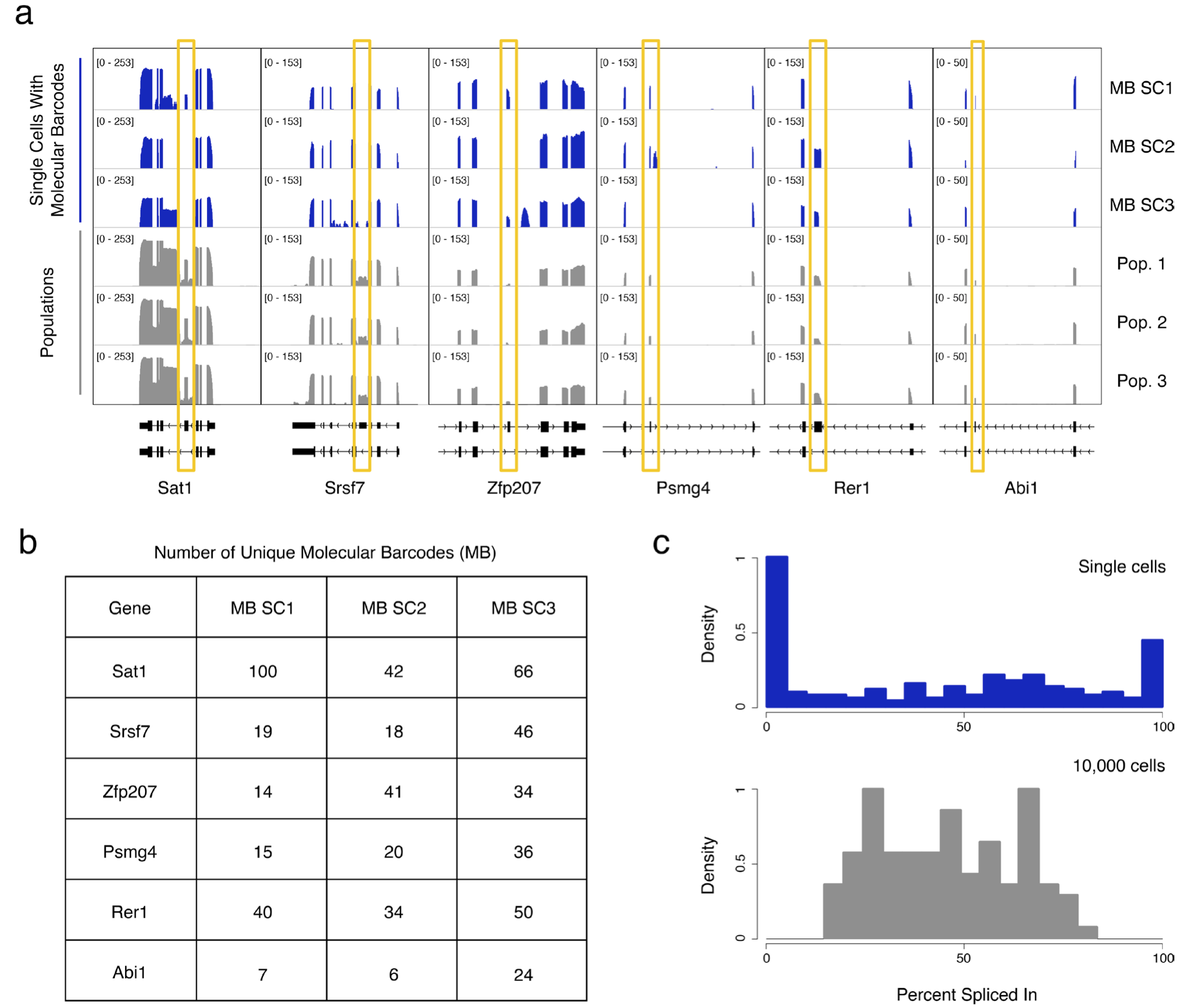
For this figure, we can only plot 5d, since it's derived directly from a table in their dataset.
Warning: these data are going to require some serious cleaning. Yay data janitorial duties!
In [59]:


barcoded = pd.read_excel('nature12172-s1/Supplementary_Table7.xlsx')
barcoded.head()
Out[59]:
The first three columns are TPM calculated from the three samples that have molecular barcodes, and the last three columns are the integer counts of molecular barcodes from the three molecular barcode samples.
Let's remove the "Unnamed: 3" column which is all NaNs. We'll do that with the .dropna method, specifying axis=1 for columns and how="all" to make sure only columns that have ALL NaNs are removed.
In [60]:


barcoded = barcoded.dropna(how='all', axis=1)
barcoded.head()
Out[60]:
Next, let's drop that pesky "GENE" row. Don't worry, we'll get the sample ID names back next.
In [61]:


barcoded = barcoded.drop('GENE', axis=0)
barcoded.head()
Out[61]:
We'll create a pandas.MultiIndex from the tuples of (sample_id, measurement_type) pair.
In [62]:


columns = pd.MultiIndex.from_tuples([('MB_S1', 'TPM'),
           ('MB_S2', 'TPM'),
           ('MB_S3', 'TPM'),
           ('MB_S1', 'Unique Barcodes'),
           ('MB_S2', 'Unique Barcodes'),
           ('MB_S3', 'Unique Barcodes')])
barcoded.columns = columns
barcoded = barcoded.sort_index(axis=1)
barcoded.head()
Out[62]:
For the next move, we're going to do some crazy pandas-fu. First we're going to transpose, then reset_index of the transpose. Just so you know what this looks like, it's this.
In [63]:


barcoded.T.reset_index().head()
Out[63]:
Next, we're going to transform the data into a tidy format, with separate columns for sample ids, measurement types, the gene that was measured, and its measurement value.
In [64]:


barcoded_tidy = pd.melt(barcoded.T.reset_index(), id_vars=['level_0', 'level_1'])
barcoded_tidy.head()
Out[64]:
Now let's rename these columns into something more useful, instead of "level_0"
In [65]:


barcoded_tidy = barcoded_tidy.rename(columns={'level_0': 'sample_id', 'level_1': 'measurement', 'variable': 'gene_name'})
barcoded_tidy.head()
Out[65]:
Next, we're going to take some seemingly-duplicating steps, but trust me, it'll make the data easier.
In [66]:


barcoded_tidy['TPM'] = barcoded_tidy.value[barcoded_tidy.measurement == 'TPM']
barcoded_tidy['Unique Barcodes'] = barcoded_tidy.value[barcoded_tidy.measurement == 'Unique Barcodes']
Fill the values of the "TPM"'s forwards, since they appear first, and fill the values of the "Unique Barcodes" backwards, since they're second
In [67]:


barcoded_tidy.TPM = barcoded_tidy.TPM.ffill()
barcoded_tidy['Unique Barcodes'] = barcoded_tidy['Unique Barcodes'].bfill()
barcoded_tidy.head()
Out[67]:
Drop the "measurement" column and drop duplicate rows.
In [68]:


barcoded_tidy = barcoded_tidy.drop('measurement', axis=1)
barcoded_tidy = barcoded_tidy.drop_duplicates()
barcoded_tidy.head()
Out[68]:
In [69]:


barcoded_tidy['log TPM'] = np.log(barcoded_tidy.TPM)
barcoded_tidy['log Unique Barcodes'] = np.log(barcoded_tidy['Unique Barcodes'])
Now we can use the convenient linear model plot (lmplot) in seaborn to plot these three samples together!
In [70]:


sns.lmplot('log TPM', 'log Unique Barcodes', barcoded_tidy, col='sample_id')
Out[70]:
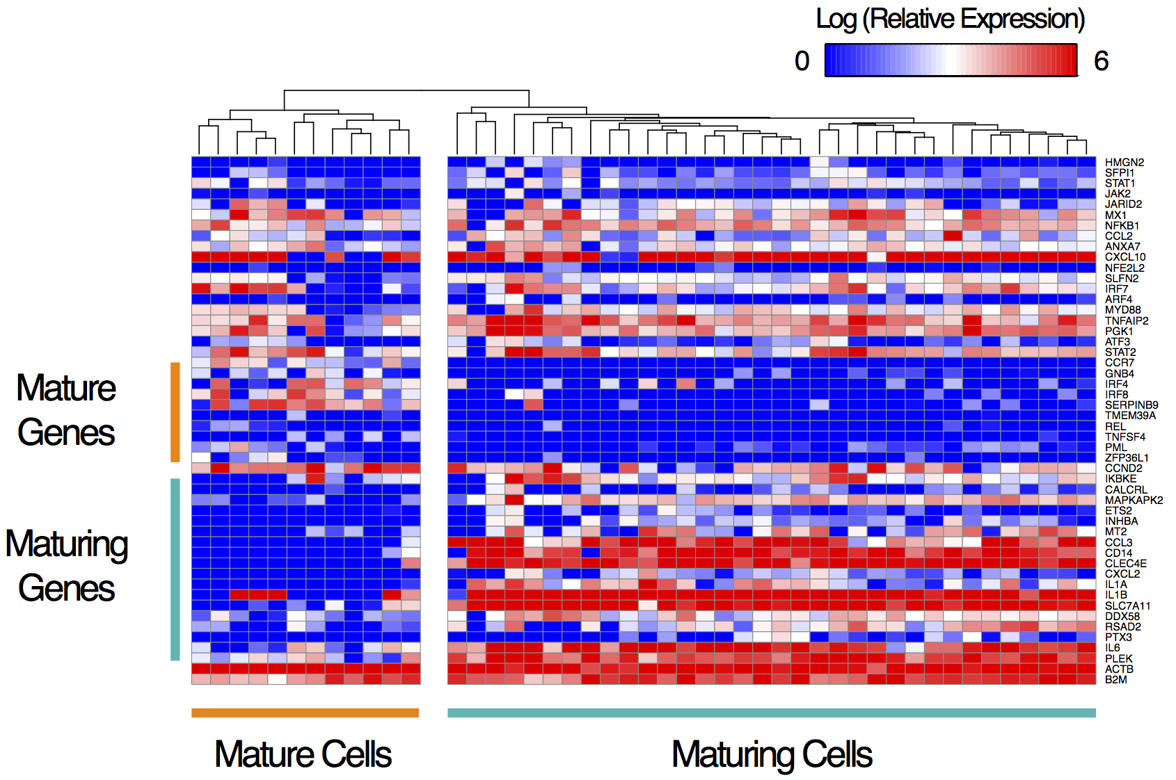
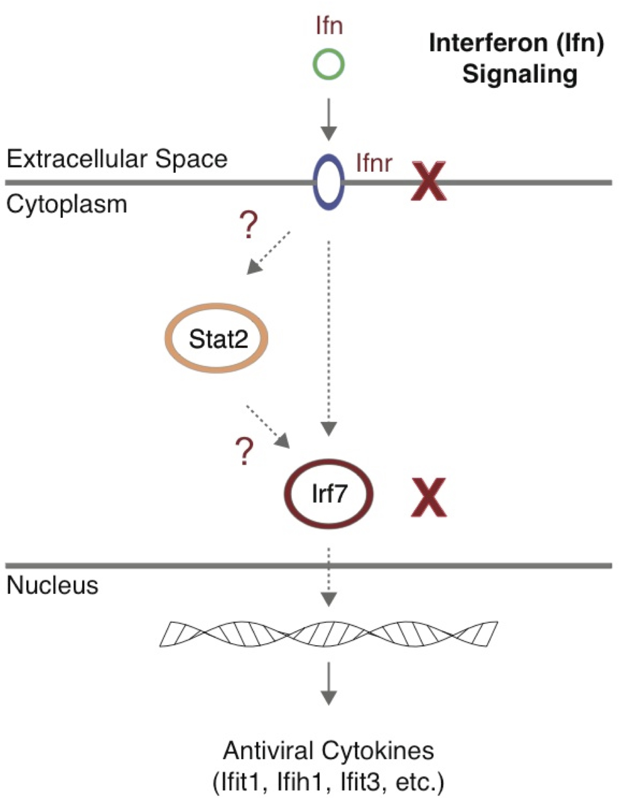
While there may be minor, undocumented, differences between the methods presented in the manuscript and the figures, the application of flotilla presents an opportunity to avoid these types of inconsistencies by strictly documenting every change to code and every transformation of the data. The biology the authors found is clearly real, as they did the knockout experiment of Ifnr-/- and saw that indeed the maturation process was affected, and Stat2 and Irf7 had much lower expression, as with the "maturing" cells in the data.