This notebook is a modified version of the one created by Jake Vanderplas for PyCon 2015.
Source and license info of the original notebook are on GitHub.</i></small>
In [2]:


%matplotlib inline
import numpy as np
import matplotlib.pyplot as plt
from scipy import stats

# use seaborn plotting defaults
import seaborn as sns; sns.set()
Clustering algorithms try to split a set of data points $\mathcal{S} = \{{\bf x}^{(0)},\ldots,{\bf x}^{(N-1)}\}$, into mutually exclusive clusters or groups, $\mathcal{G}_0,\ldots, \mathcal{G}_{K-1}$, such that every sample in $\mathcal{S}$ is assigned to one and only one group.
Clustering algorithm belong to the more general family of unsupervised methods: clusters are constructed using the data attributes alone. No labels or target values are used. This makes the difference between a clustering algorithm and a supervised classification algorithm.
There is not a unique formal definition of the clustering problem. Different algorithms group data into clusters following different criteria. The appropriate choice of the clustering algorithm may depend on the particular application scenario.
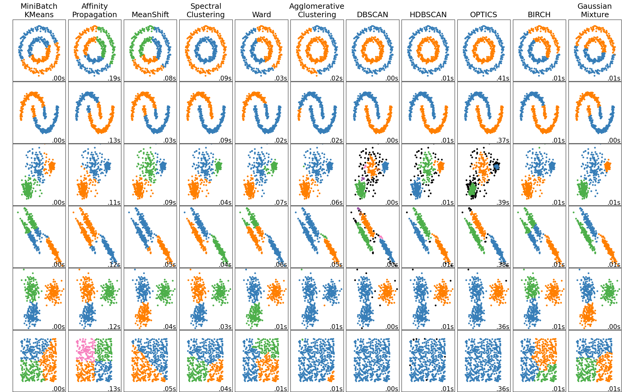
The image below, taken from the scikit-learn site, shows that different algorithms follow different grouping criteria, clustering the same datasets in different forms.
<img src="http://scikit-learn.org/stable/_images/sphx_glr_plot_cluster_comparison_001.png", width=600>
In any case, all clustering algorithms share a set of common characteristics. A clustering algorithm makes use of some distance or similarity measure between data points to group data in such a way that:
$K$-Means is a proximity-based clustering algorithm. It searches for cluster centers or centroids which are representative of all points in a cluster. Representativenes is measures by proximity: "good" cluster are those such that all data points are close to its centroid.
Given a dataset $\mathcal{S} = \{{\bf x}^{(0)},\ldots,{\bf x}^{(N-1)}\}$, the $K$-means tries to minimize the following distortion function:
$$D = \sum_{k=1}^K \sum_{{\bf x} \in {\cal{G}}_k}\|{\bf x}-{\mu}_k\|_2^2$$where ${\mu}_k$ is the centroid of cluster $\mathcal{G}_k$.
$K$-means convergence is guaranteed ... but just to a local minimum of $D$.
Different initialization possibilities:
Typically, different runs are executed, and the best one is kept.
Check out the Scikit-Learn site for parameters, attributes, and methods.
In [4]:


from sklearn.datasets.samples_generator import make_blobs
X, y = make_blobs(n_samples=300, centers=4,
                  random_state=0, cluster_std=0.60)
plt.scatter(X[:, 0], X[:, 1], s=50);
plt.axis('equal')
plt.show()
By eye, it is relatively easy to pick out the four clusters. If you were to perform an exhaustive search for the different segmentations of the data, however, the search space would be exponential in the number of points. Fortunately, the $K$-Means algorithm implemented in Scikit-learn provides a much more convenient solution.
Exercise:
The following frament of code runs the $K$-means method on the toy example you just created. Modify it, so that you can try other settings for the parameter options implemented by the method. In particular:
In [6]:


from sklearn.cluster import KMeans
est = KMeans(2)  # 4 clusters
est.fit(X)
y_kmeans = est.predict(X)
plt.scatter(X[:, 0], X[:, 1], c=y_kmeans, s=50, cmap='rainbow');
plt.axis('equal')
plt.show()
In [7]:


from fig_code import plot_kmeans_interactive
plot_kmeans_interactive();
In [8]:


from sklearn.datasets import load_digits
digits = load_digits()

print 'Input data and label number are provided in the following two variables:'
print "digits['images']: " + str(digits['images'].shape)
print "digits['target']: " + str(digits['target'].shape)
Next, we cluster the data into 10 groups, and plot the representatives (centroids of each group). As with the toy example, you could modify the initialization settings to study the impact of initialization in the performance of the method
In [9]:


est = KMeans(n_clusters=10)
clusters = est.fit_predict(digits.data)
est.cluster_centers_.shape
Out[9]:
In [10]:


fig = plt.figure(figsize=(8, 3))
for i in range(10):
    ax = fig.add_subplot(2, 5, 1 + i, xticks=[], yticks=[])
    ax.imshow(est.cluster_centers_[i].reshape((8, 8)), cmap=plt.cm.binary)
We see that even without the labels, KMeans is able to find clusters whose means are recognizable digits (with apologies to the number 8)!
The following fragment of code projects the data into the two "most representative" dimensions, so that we can somehow visualize the result of the clustering (note that we can not visualize the data in the original 64 dimensions). In order to do so, we use a method known as Principal Component Analysis (PCA). This is a method that allows you to obtain a 2-D representation of multidimensional data: we extract the two most relevant features (using PCA) and look at the true cluster labels and $K$-means cluster labels:
In [11]:


from sklearn.decomposition import PCA

X = PCA(2).fit_transform(digits.data)

kwargs = dict(cmap = plt.cm.get_cmap('rainbow', 10),
              edgecolor='none', alpha=0.6)
fig, ax = plt.subplots(1, 2, figsize=(8, 4))
ax[0].scatter(X[:, 0], X[:, 1], c=est.labels_, **kwargs)
ax[0].set_title('learned cluster labels')

ax[1].scatter(X[:, 0], X[:, 1], c=digits.target, **kwargs)
ax[1].set_title('true labels');
In [12]:


from sklearn.metrics import confusion_matrix

conf = confusion_matrix(digits.target, est.labels_)
print(conf)

plt.imshow(conf,
           cmap='Blues', interpolation='nearest')
plt.colorbar()
plt.grid(False)
plt.ylabel('true')
plt.xlabel('Group index');

#And compute the number of right guesses if each identified group were assigned to the right class
print 'Percentage of patterns that would be correctly classified: ' \
            + str(np.sum(np.max(conf,axis=1)) * 100. / np.sum(conf)) + '%'
This is above 80% classification accuracy for an entirely unsupervised estimator which knew nothing about the labels.
One interesting application of clustering is in color image compression. For example, imagine you have an image with millions of colors. In most images, a large number of the colors will be unused, and conversely a large number of pixels will have similar or identical colors.
Scikit-learn has a number of images that you can play with, accessed through the datasets module. For example:
In [13]:


from sklearn.datasets import load_sample_image
china = load_sample_image("china.jpg")
plt.imshow(china)
plt.grid(False);
The image itself is stored in a 3-dimensional array, of size (height, width, RGB). For each pixel three values are necessary, each in the range 0 to 255. This means that each pixel is stored using 24 bits.
In [14]:


print 'The image dimensios are ' + str(china.shape)
print 'The RGB values of pixel 2 x 2 are ' + str(china[2,2,:])
We can envision this image as a cloud of points in a 3-dimensional color space. We'll rescale the colors so they lie between 0 and 1, then reshape the array to be a typical scikit-learn input:
In [15]:


X = (china / 255.0).reshape(-1, 3)
print(X.shape)
We now have 273,280 points in 3 dimensions.
Our task is to use KMeans to compress the $256^3$ colors into a smaller number (say, 64 colors). Basically, we want to find $N_{color}$ clusters in the data, and create a new image where the true input color is replaced by the color of the closest cluster. Compressing data in this way, each pixel will be represented using only 6 bits (25 % of the original image size)
In [16]:


# reduce the size of the image for speed. Only for the K-means algorithm
image = china[::3, ::3]
n_colors = 32

X = (image / 255.0).reshape(-1, 3)

model = KMeans(n_colors)
model.fit(X)
labels = model.predict((china / 255.0).reshape(-1, 3))
#print labels.shape
colors = model.cluster_centers_
new_image = colors[labels].reshape(china.shape)
new_image = (255 * new_image).astype(np.uint8)

#For comparison purposes, we pick 64 colors at random
perm = np.random.permutation(range(X.shape[0]))[:n_colors]
colors = X[perm,:]

from scipy.spatial.distance import cdist
labels = np.argmin(cdist((china / 255.0).reshape(-1, 3),colors),axis=1)
new_image_rnd = colors[labels].reshape(china.shape)
new_image_rnd = (255 * new_image_rnd).astype(np.uint8)

# create and plot the new image
with sns.axes_style('white'):
    plt.figure()
    plt.imshow(china)
    plt.title('Original image')

    plt.figure()
    plt.imshow(new_image)
    plt.title('{0} colors'.format(n_colors))

    plt.figure()
    plt.imshow(new_image_rnd)
    plt.title('{0} colors'.format(n_colors) + ' (random selection)')
Compare the input and output image: we've reduced the $256^3$ colors to just 64. An additional image is created by selecting 64 colors at random from the original image. Try reducing the number of colors to 32, 16, 8, and compare the images in these cases.